How to Use Smart Web Design to Improve CRO
What’s the first thing you plan when launching your company and digital presence?
Getting your web design sorted is probably high up there as one of your first tasks and lucky you, you’ve found a talented and creative web designer you just love.
You’re satisfied with the pretty and dynamic style your web designer has crafted.
You feel it speaks to your “brand personality”, it’s really “innovative” and “authentic”. All in all, it’s so very “YOU”.
Job done, right? Time to move onto the marketing tasks.
……. Well, that’s one approach to web design but it certainly isn’t the most profitable one.
Web design, more than any other discipline, has the power to significantly improve your CRO, if you use it correctly.
What is CRO?
Yet another annoying digital marketing acronym and made up discipline. We’ve got to be kidding, haven’t we?
But CRO or conversion rate optimisation is no laughing matter.
Unless, of course, you utilise it well, in which case feel free to laugh all the way to the bank.
Why? Because CRO is all about making more sales.
It’s about optimising your web pages for those all-important conversions and for many businesses this means leads and/or sales.
Every professional who is a cog in the wheel of digital marketing believes their contribution is the most important. Whether it’s UX, SEO, content marketing, social, web development or design. They all believe that is the most vital piece of the puzzle.
The fact is all of these elements are crucial, but none are directly focused on the core goal of business: Making money.
This is the long-term, indirect objective that all of these skill areas work towards but only conversion rate optimisation is laser focused on this goal. Utilising CRO can have one of the biggest impacts on ROI and investing in CRO tools and techniques can boost ROI by an average of 223%..
Sure, without the support of content marketing, social and SEM, etc. it cannot attract the visitors it needs to do the end job, but if your audience doesn’t convert at the end of the day all that marketing effort was for nought.
What Website Features Impact CRO?
Many different factors can affect the optimisation of a web page for conversions:
- Is the right type of audience, AKA your target audience, reaching the page?
- Does the copy resonate with that audience and mitigate pain points?
- Is the imagery of the web page both pleasing and convincing to the audience of your product/services’ value?
- Is the layout of the page guiding them to a conversion action?
- Are there the right CTAs compelling them to conversion?
- Is the checkout or lead capture form easy enough?
- Is the page qualifying leads properly?
Why Web Design Has a Big Impact on CRO
As you can see from our list of features that influence CRO, copy and proper audience-targeted marketing are big players, but strong web design is a must have to achieve many of the integral features of a highly converting web page.
Smart web design is one of the most influential factors because of the psychological effect it places on visitors leading them to a conversion or repelling them.
While web designers are not necessarily CRO experts and CRO may not be the first thing on their minds when building your brand image, their skill as designers has a great deal of impact on the success of CRO.
So, how can you guide creative web designers to use smart design techniques that actively improve CRO and increase those profits?
10 Smart Web Design Strategies To Improve CRO
1) Make a Connection with Images
In the age of social media-induced micro attention spans who needs to read when a picture says a thousand words?
Worries about the lack of literacy skills in young people aside, we always have been highly visual creatures and it is still true that the images you use can have a major impact of visitors. They can even affect conversion rates.
That’s right, the simple act of changing an image or using more or less images could profoundly affect your CRO.
A large portion of web and graphic design is crafting images and choosing the right images for a web page, so what kind of images actually work.
Well you’ve probably heard that human faces are a great technique and it’s true.
However, before you start slapping grinning smiles all over your website, take heed. Images of real people, i.e. your staff, will out perform stock images.
Modern internet users are constantly bombarded with advertisements online and therefore have grown a sixth sense about authenticity.
Take a look at our own homepage header image here at Perth Web Design:
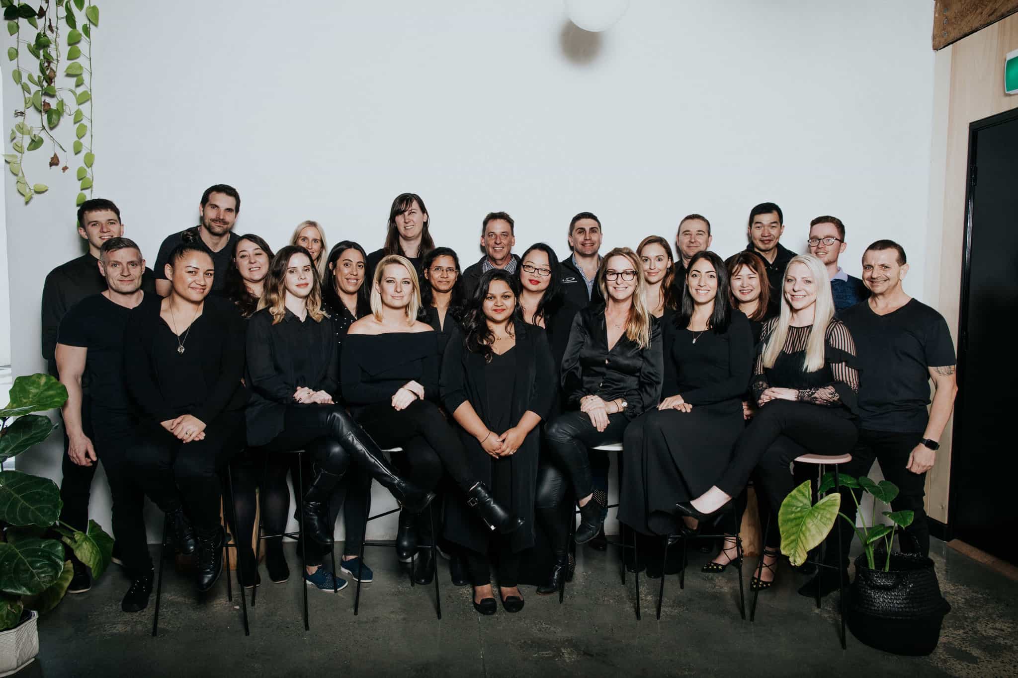
It was important for us to showcase our real staff. We weren’t just interested in using human faces to influence our audience, we want them and our existing clients to know exactly who they’re working with and who will be helping with their accounts.
We understand that a human connection can be reassuring and we love working one to one with our clients. Our visitors feel this vital ethos of our company straight away.
It works better than this eerily familiar and posed stock photo that features people our clients will never meet:

Of course, human faces aren’t the be all and end all of imagery. While they have be proven effective, this will vary from industry to industry and from product to product.
You should always test which images work best in your web design to ensure you are using real data-led CRO techniques. You may find non-human graphics work better for the product you’re selling.
2) Make the Right Statement with Colours
“I’m only buying this miraculous life saving product if it comes in pink!”
If visual impact is a big factor on customer behaviour, then the colour of your web page and its elements will be important, as well as the specific images you use.
Colour psychology has long played an important role in web design and marketing. This may be an area in which your web designer is already well versed, but you need to ensure the colours you choose also send the right message for your industry.
It is a well-known fact that black should be used sparingly in web design, but this rule is reversed if you’re selling high-end luxury items because black evokes decadence and power.
Blue is calming, making it ideal for legal businesses, who need to instil reassurance and trustworthiness, yet blue can be a bit boring if you’re trying to sell something exciting like a sports car.
It isn’t just your industry that can affect how people react to colour, it is the demographic of your audience. Different genders, age groups and sub-cultures will have different attitudes and emotional reactions to colours, all of which has an impact on conversions.
Take a look at this infographic from Kissmetrics and Neil Patel into the power colour choice can have on conversions:

Image Credit: https://neilpatel.com/blog/how-colors-affect-conversions/
An important take-away from this infographic is that it isn’t just colour in general that matters, but which elements use it, like product labels and CTA buttons. These often need to stand out from the background of your webpage to elicit that conversion action.
While colour psychology does matter and web designers should definitely study it, you should never leave it up to chance. Attitudes to colour can shift and you should test different colours against each other to see which your audience prefer.
3) Get Minimalist…….But Not Too Minimalist!
Ah, minimalism. The stuff of weird post-modern plays and snobby home décor programmes.
Or is it the web design solution to improve your conversions? Quite probably.
When we say go minimalist with web design, what we really mean is stop over complicating everything. Rather than using one page to bombard an audience with all your USPs, go for a flat, minimalist design and strip it back to the essential elements, so you can really focus people on one action.
You might think web design is all about beauty and leaving a lasting impression. However, if you want to drive up your ROI you should always place usability over beauty.
One of the best ways to hone in on conversions is to only have one clear call to action on a web page.
When Whirlpool stripped back their web page from 4 CTAs to just 1, their CRO increased by 42%. Less is more certainly held true in this case.
Don’t let that statistic get you too excited and completely strip your web pages of all personality. Remember we said not too minimalist and with good reason.
If people cannot find the button for converting they won’t or if none of the elements seem related and there isn’t a convincing reason to convert, they just won’t.
4) Opt for Tiny Changes Not Big Design Overhauls
Ok, so there are a lot of different techniques that can utilise web design tactics to boost conversion rates, but this is one of the biggest.
Web designers are creatives and will often want to put their mark on a project and help a company find their true brand identity BUT slow down!
Clever web design improves your CRO by small tweaks not huge changes.
If you change too many elements in a web page at once, it is much harder to see which feature is driving positive increases in conversions. We all know it may be a combination of elements but there is no way to get the perfect formula if you cannot see which change had what effect.
At first glance this may seem less fun and dramatic but big overhauls don’t help your company use data to actively increase profits.
Think micro changes not major refurbishments, otherwise your web design choices are just stabs in the dark, rather than data supported decisions that have been tested and proven.
Web designers must try to change only one element at a time and see its effect. Don’t change the headline, copy, images and conversion button colour all at once, pick one feature to change and test.

Image Credit:https://effectiveexperiments.com/blog/five-ways-to-screw-up-your-ab-tests/
……………..But there are, of course, exceptions to every rule. Sometimes a website will need a completely new design even before you begin testing small improvement tweaks for CRO.
How can a web designer know if a website requires a big change or small tweaks to boost CRO?
Trust us, you’ll know an overhaul job when you see one.
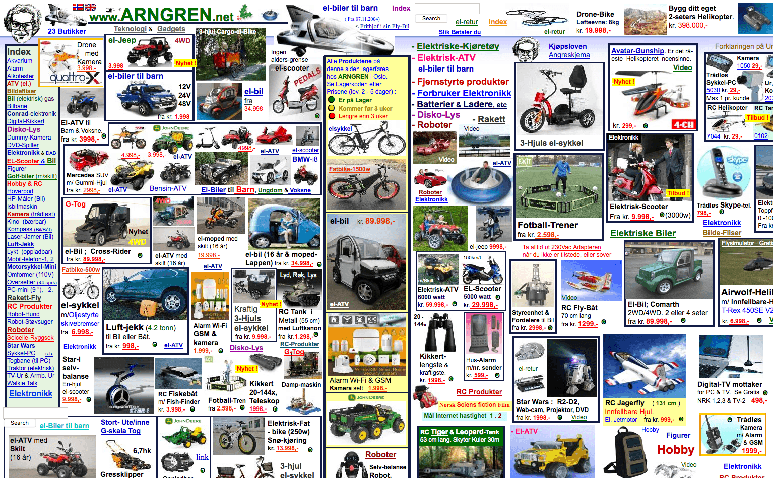
Image Source and Credit: https://www.arngren.net/
Always opt for small tweaks unless the website is so bad that bulldozing what has gone before in a fiery apocalypse and rebuilding from the ashes is the only way to move forward.
5) Use Multi-Variant Testing & Data-Led Web Design
If you’ve ever encountered CRO before you knew this point was coming.
Multi-variant testing is really what turns web design into CRO.
While you can gain insights from simply making a small change and waiting to see if conversions improve or not, this is not efficient.
It is better to create multiple variations of your web page focused on one small tweak. Then divert equal amounts of traffic to each version and see which yields the most conversions, for example, you might create 4 versions of your headline to test.
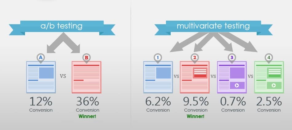
Image Credit: https://www.dynamicyield.com/blog/ab-vs-multivariate-test/
Again, multi-variant testing needs to follow the same rules as our tiny tweaks tip. While you have multiple versions, they should be testing one hypothesis and focus on one element to test, not different features on the page.
6) Balance Innovation with Familiarity
It’s good to be different. The weird is beautiful and the unique get all the attention……True but being different can also confuse or even repel people and that goes for web design too.
Good web design often focuses on innovation. Standing out from competitors is a great way to develop brand affinity but if you want to improve your CRO you need to temper innovation in web design with familiarity.
The problem is that dynamic websites often don’t convert well. This is because, as users we become familiar with certain cues when browsing online, for example, we all had to get used to the hamburger icon indicating a drop-down navigation on mobile. It took a bit of getting used to, but now we all have a shared knowledge.
If a web designer gets too innovative with important interactive elements on a site, like the buy now button, it can cause people to get lost or miss the CTA button because it doesn’t look how they expect it to appear.
Familiarity can also be important for expectations within an industry. While, there is nothing wrong with being ground-breaking, it can rub people the wrong way if it doesn’t suit what they expect from an industry. Legal or financial institutions are industries that must be wary of how ground-breaking they appear.
Marketing Land shows a perfect example of innovative web design gone too far. Check out this website for a bank:

Image Credit: https://marketingland.com/win-fights-web-designer-use-cro-tactics-127931
It’s interesting but is it someone you’d trust with your money? The National Australia Bank knows it can be best to stay a little safe with web design:
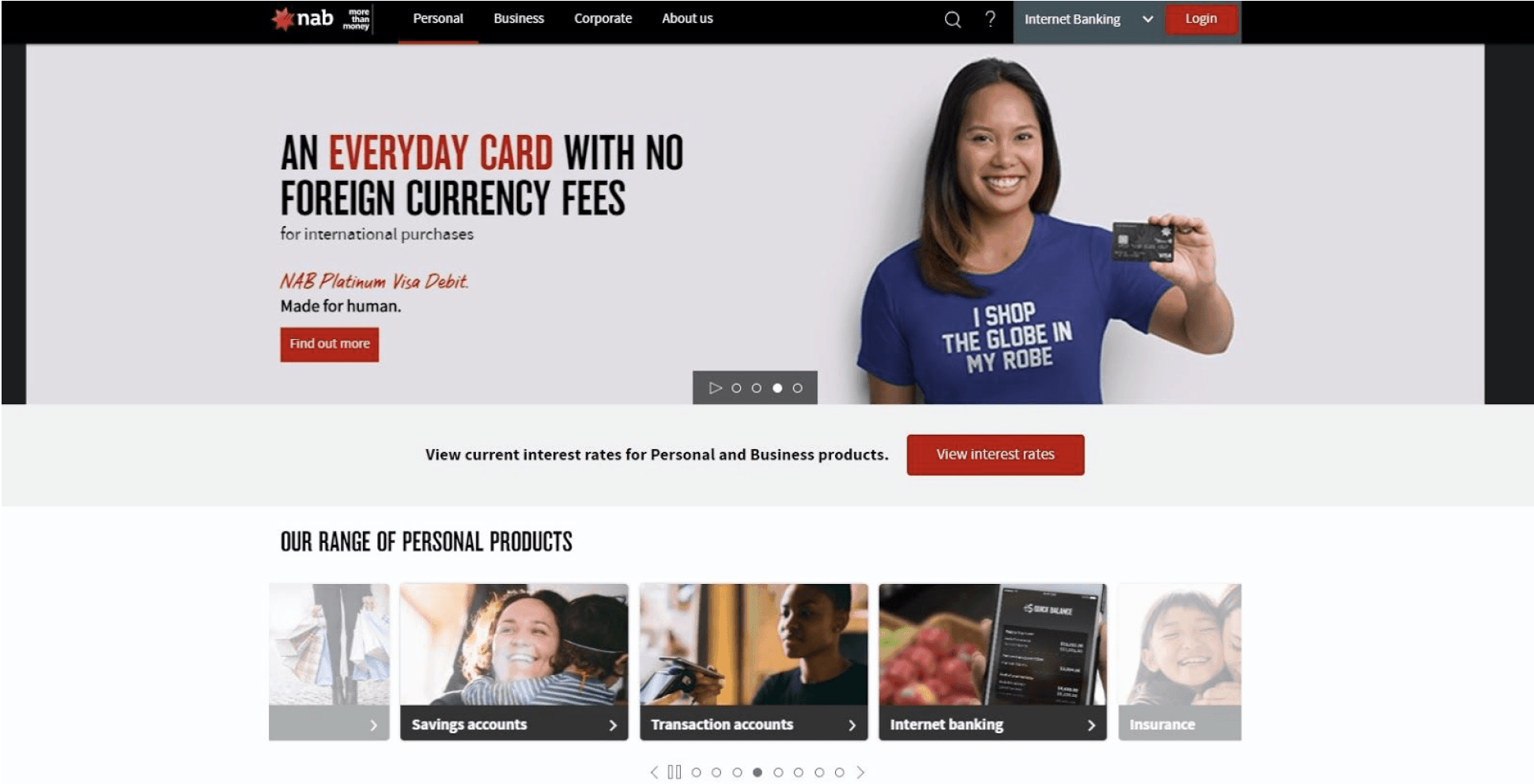
Balancing familiarity and innovation can be tricky when it comes to web design and CRO. After all, if you follow the rules of familiarity too much, then every website will look similar and you will struggle to make an impression.
B, a digital banking service based in the UK, cleverly balances innovation and familiarity in the personal finance sector:
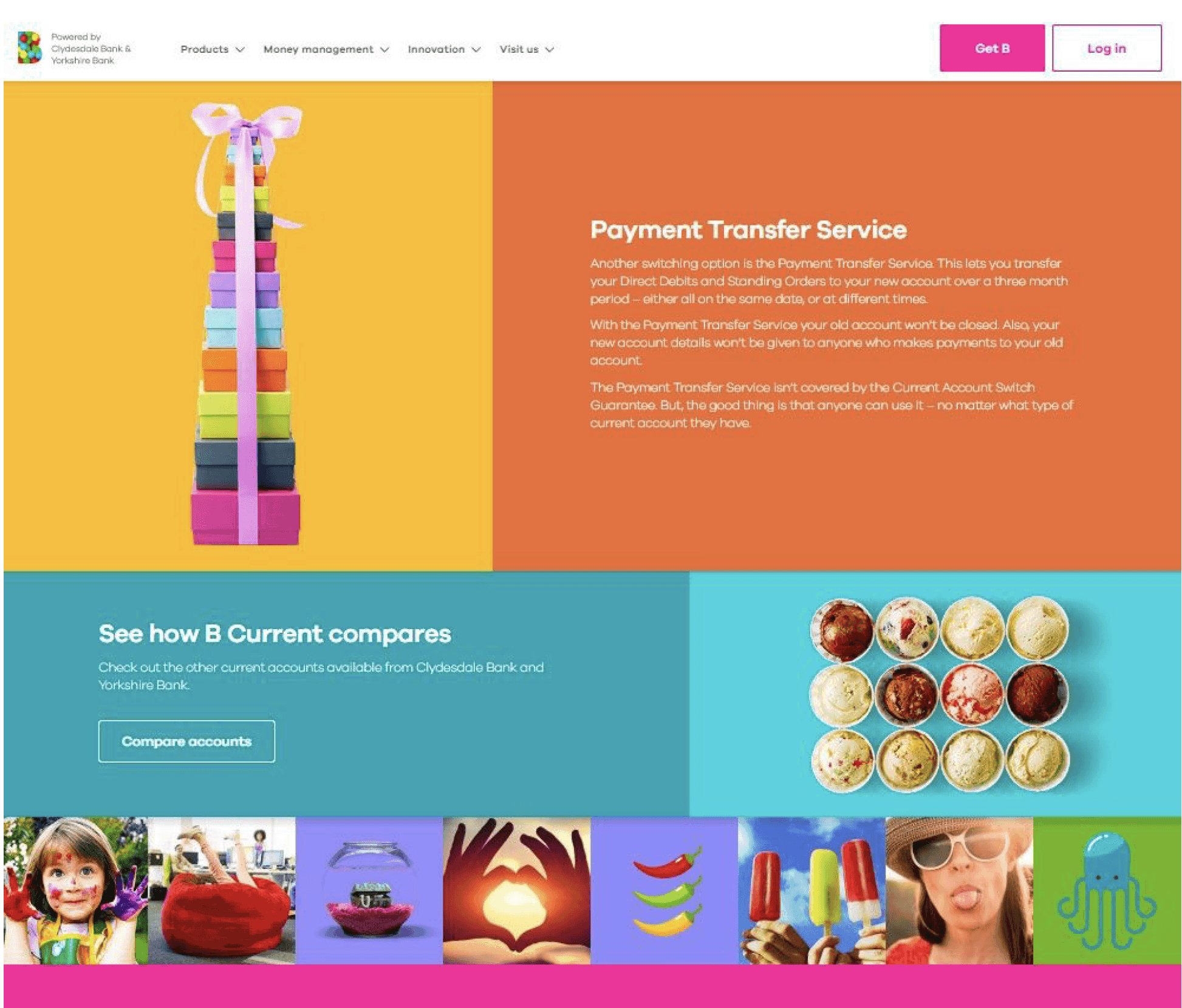
While they have flipped the familiar sombre colours and trust worthy corporate images of banking on its head and embraced loud colours and casual, busy, fun images, the actual layout and call to action buttons of the website are deceptively simple and familiar.
7) Just Be Logical
Before you even start deciding which elements to split test and how familiar vs innovative you want to get with your web design, you need to have a starting point.
Once you have your minimalist core features chosen; your singular CTA, your kickass headline, your dynamic image, the perfect colours and your convincing copy, how do you decide on a starting structure?
You need some order to your page layout before you can highlight elements to tweak and test, so we suggest starting from a place of logic.
This means making sure each element is in a logical order on the page.
When you’re trying to improve your conversion rate, you might be tempted to put your CTA button first and foremost, but this makes little sense. Even in a highly minimalist website design, your job is to convince people to convert and then offer them an easy opportunity to do so.
Compelling testimonials and key pain mitigation points should be positioned right before your conversion button.
If you’re struggling to find the perfect layout order, consider the F reading pattern. This is based on Western reading patterns, which typically go from left to right and top to bottom.
Studies show that when people are reading online, particularly when they are skim reading, their eyes are drawn to certain areas more than others and this follows the shape of an F.
You still need to keep a logical order within the F pattern, so resist putting your conversion button in the top left. VWO.com show how Underwater Audio aced their use of a logical F pattern for their landing page and increased sales by 35.6%:
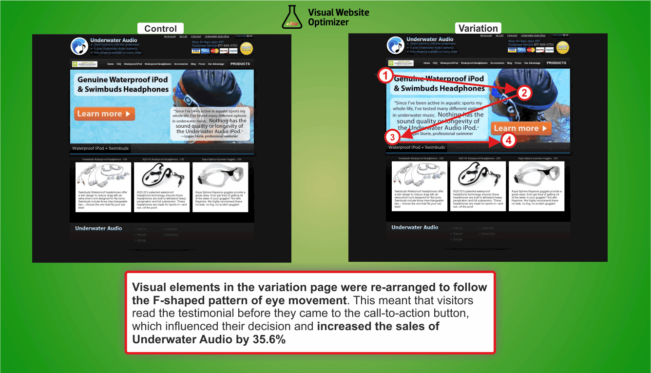
Image Credit: https://vwo.com/blog/improved-visual-hierarchy-increases-sales/
The core elements are kept near the top of the page but follow the simple pattern of headline > main relevant image > compelling testimonial > conversion button.
8) Pay More Attention to Responsive Design
Considering how we’re all addicted to our smartphones, we shouldn’t really have to remind you of this one, but just in case – Don’t Forget About Responsive Design.
Most platforms make websites responsive by default but if you want to increase conversions on mobile, you need to go the extra mile and consider the mobile view in every step of your design process.
Think about how the elements of your page will sit on mobile.
In your responsive design, you carefully planned the position of your CTA. Is it still positioned prominently on a mobile view or is it pushed too low down the page? Are the elements too cramped on mobile, making the checkout button more difficult to click?
- Keep It Speedy
Images, video, interactive elements – all these can increase conversions, unfortunately they can also slow down your site and nothing chases away an audience faster than a slow loading web page.
According to Neil Patel even a one second delay can lower conversion rates by 7%.
It’s back to uber minimalism again it seems, however, if you optimise images for speed then you can still use strong visuals and have a speedy site.
Ensure that you upload images in the best file format (JPG) and reduce images to the smallest possible size without compromising quality.
Luckily there are plenty of website plugins that make optimising your site for speed a breeze, such as Optimizilla, Lazy Load and Speed Booster Pack. ImageResize.org, Gimp and Adobe Photoshop are also great for compressing images.
10) Get Rid of Those Sliders
Ah, the scrolling sliders. You know the ones. They’re filled with large banner images and for a while every hotel business seemed obsessed with having them on their websites.
Sadly, although these features give you a chance to showcase more images and CTAs on a homepage, most CRO experts agree they are a poor choice for conversions.
This is because our eyes pay more attention to movement. It’s an essential evolutionary trait we developed to help us hunt food and avoid predators.
Surely that means our eyes are drawn to sliders, making them a good thing? Funnily enough, no. We’re so focused on movement we miss the content of sliders and our brains just focus on the fact they are moving. Often, they slide too fast for us to concentrate on the images and CTAs, let alone fully read them or click a button.
They’re also a major negative on mobile where they will appear small and hard to click and likely slow down your site. Remember it is much easier to scroll down than to swipe on mobile.
Are You Ready for More Conversions?
Whether you’re a web designer looking to enhance your offering with conversion focused design or a business looking to guide your web designers into implementing CRO, this handy list will be a great start for attracting more sales.
