5 Ways to Design Awesome Testimonial Pages That Convert

Your customers trust other customers more than they trust you. That’s not an insult — it’s human psychology. And the businesses that understand this build testimonial pages that do serious conversion work.
We’ve designed testimonial pages for dozens of Australian businesses at PWD, and the difference between a page that just sits there and one that actually moves people toward a purchase decision comes down to deliberate design choices. Not luck, not volume — design.
Here are five ways to design testimonial pages that convert browsers into buyers.
Lead With Specific, Outcome-Driven Testimonials
Generic praise doesn’t convert. “Great service!” tells a prospect nothing useful. But “PWD increased our organic traffic by 340% in six months” — that’s a testimonial that does real work.
The best testimonial page examples share a common thread: specificity. Numbers, timeframes, and tangible outcomes give prospects something to anchor their expectations to. When someone reads that a business similar to theirs achieved measurable results, the mental leap from “maybe” to “let’s talk” gets significantly shorter.
Here’s how to structure outcome-driven testimonials:
- Before/after framing — Show where the client started and where they ended up. “We were getting 200 visits a month. After working with PWD, we hit 3,400 monthly visits within a year.”
- Quantify the impact — Revenue growth percentages, lead increases, time saved. Concrete numbers build credibility faster than adjectives.
- Name the specific service — Don’t just say “they helped us.” Say “their SEO strategy delivered results within the first quarter.”
- Include the customer’s industry — Prospects look for social proof from businesses like theirs. A Perth tradesperson wants to see what you did for other trades, not a tech startup in Sydney.
If your current testimonials are vague, go back to your happiest clients and ask for specifics. Most are glad to provide them — they just weren’t asked the right questions initially.
Design for Scanability, Not Just Readability
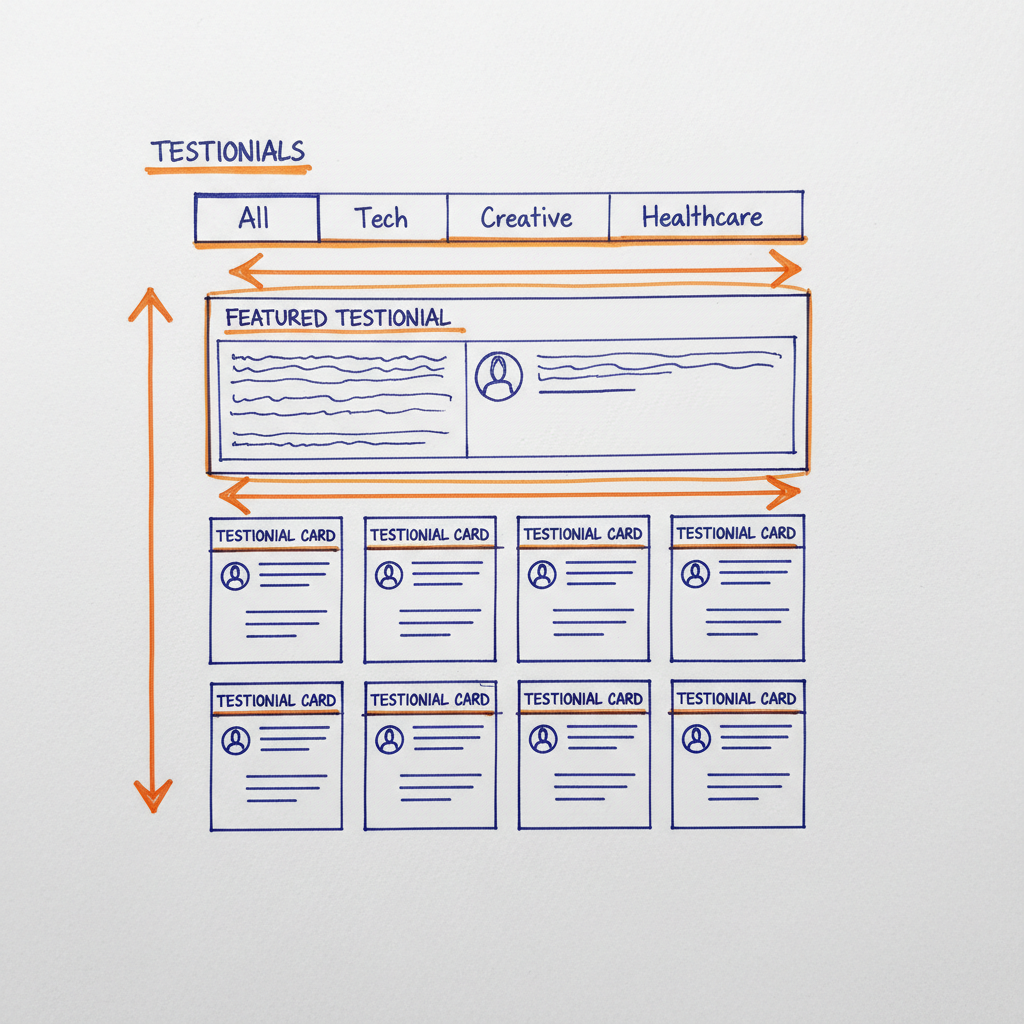
Nobody reads a testimonial page top to bottom. People scan. They look for signals that match their situation — their industry, their problem, their size of business. Your testimonial page design needs to support that scanning behaviour.
Here’s what works:
Use Visual Hierarchy to Guide Attention
Every testimonial should have a clear headline — either a pull quote or the client’s key result. This is what people read first. The full testimonial text sits beneath it for those who want more detail.
Think of each testimonial as a mini landing page. Headline grabs attention, body provides substance, attribution builds trust.
Categorise by Industry or Service
If you serve multiple industries, add filter tabs or clear sections. A restaurant owner shouldn’t need to scroll past software testimonials to find relevant social proof. Category filters reduce friction and help prospects self-select into the testimonials that matter most to them.
Whitespace Is Your Friend
Cramming twenty testimonials onto a single page with no breathing room creates visual noise. Give each testimonial space. A page with eight well-presented testimonials outperforms a wall of thirty cluttered ones every time. Good web usability principles apply here as much as anywhere else on your site.
Add Faces, Names, and Context — Real People Convert
Anonymous testimonials are worth almost nothing. “J.S. from Sydney” doesn’t build trust — it raises suspicion. In 2026, with AI-generated content everywhere, authenticity markers matter more than ever.
Every testimonial on your page should include:
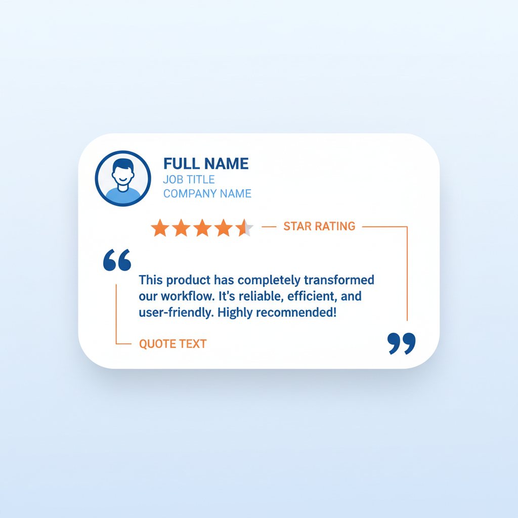
- Full name — First name and last initial at minimum, full name ideally.
- Professional headshot or photo — Faces create emotional connection. Studies consistently show that testimonials with photos receive significantly more engagement than text-only versions.
- Business name and role — “Sarah Chen, Marketing Director at Bloom Florists” is far more persuasive than “S.C., Business Owner.”
- Location — Particularly important for local businesses. Perth businesses want to see Perth clients.
- Star ratings or scores — If you have Google Reviews or industry-specific ratings, display them. They provide an instant visual trust signal.
The more real and verifiable a testimonial feels, the more weight it carries. Consider linking to the client’s business website or LinkedIn profile where appropriate — it’s the ultimate authenticity signal.
This principle extends to your broader brand identity. Authentic testimonials reinforce the trust your brand is trying to build across every touchpoint.
Incorporate Video Testimonials for Maximum Impact
Video testimonials convert at a level that text simply can’t match. When a prospect watches a real person talk about their experience with your business, the trust transfer is immediate and powerful.
You don’t need a film crew. Most modern smartphones shoot excellent video. What matters is authenticity over production value. A genuine 60-second clip of a client sharing their results — filmed in their own office or shop — carries more weight than a polished, scripted production.
Video Testimonial Best Practices
- Keep them under 90 seconds — Attention spans are short. Get to the good stuff fast.
- Start with the result — Don’t bury the outcome at the end. Lead with “Our revenue went up 40%” then explain how.
- Include text summaries — Not everyone can watch video (commuters, office workers). Provide a written pull quote alongside each video.
- Optimise for mobile — Over 60% of web traffic comes from mobile devices. Ensure videos are responsive and load quickly on mobile connections. Mobile-friendly design isn’t optional.
- Add structured data — VideoObject schema helps your testimonial videos appear in Google’s video results, expanding your search visibility.
Place your strongest video testimonial near the top of the page. It sets the tone and builds credibility before the visitor reads a single word of text.

Position Testimonials Strategically Across Your Site
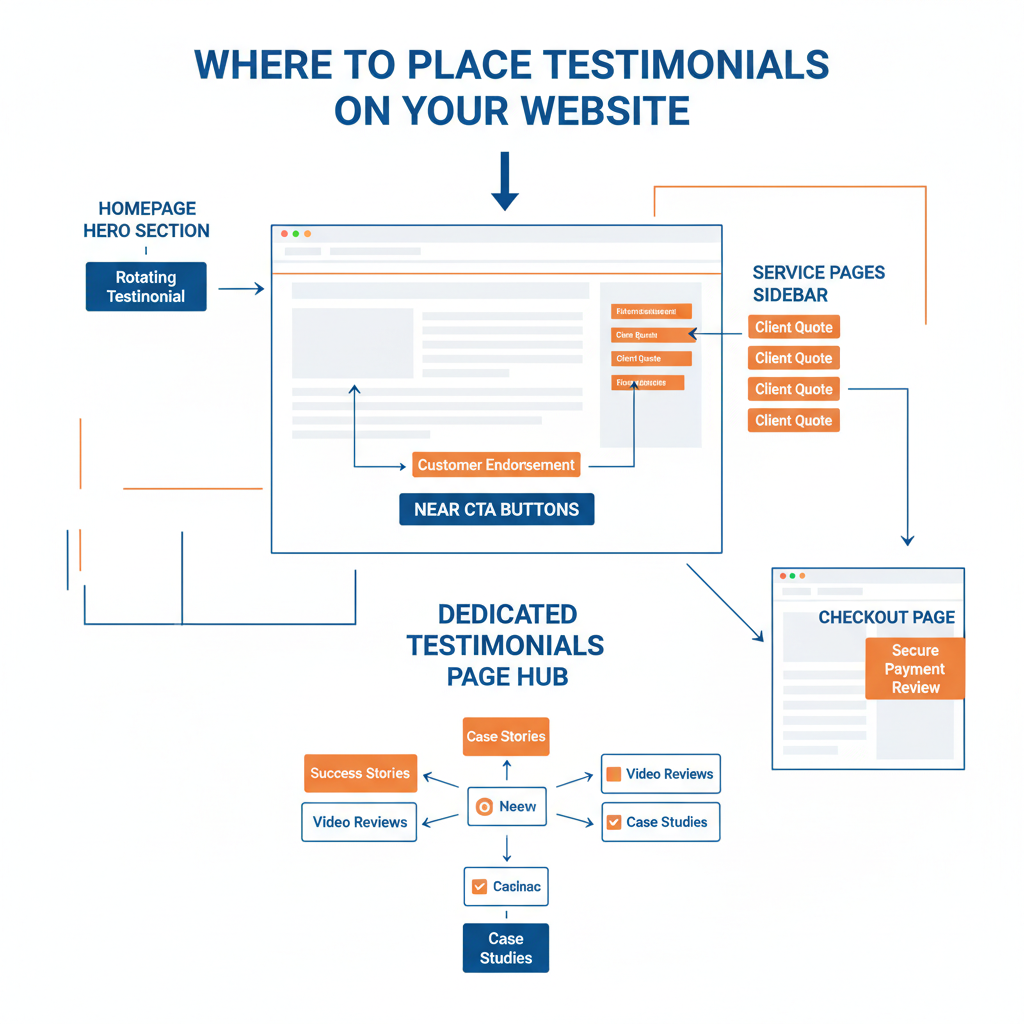
A dedicated testimonial page is essential, but it shouldn’t be the only place your social proof lives. The most effective testimonial page design treats the main page as a hub while distributing social proof strategically throughout the entire site.
Where to Place Testimonials Beyond the Main Page
- Service pages — Match testimonials to the specific service being described. An SEO testimonial on your SEO service page is far more relevant than a generic one.
- Near CTAs — Place a short testimonial directly above or beside your call-to-action buttons. Social proof at the decision point reduces hesitation.
- Checkout and contact pages — These are high-anxiety moments. A reassuring testimonial about your checkout process or response times can prevent drop-offs.
- Homepage — Feature 2-3 of your strongest testimonials on the homepage with a link to the full testimonial page.
- Blog posts — Relevant case study snippets within educational content create natural conversion pathways.
Build a Testimonial Content Strategy
Don’t wait for testimonials to appear. Actively collect them as part of your client offboarding process. Send a structured questionnaire three months after project completion — long enough for results to materialise, soon enough that the experience is fresh.
Ask pointed questions:
- What specific problem were you trying to solve?
- What measurable results have you seen?
- What would you tell someone considering this service?
- Would you be willing to record a short video?
These questions produce testimonials that sell — because they’re structured around the buyer’s decision-making process, not just general satisfaction.
The Trust Architecture That Drives Conversions
Testimonial pages that convert aren’t just collections of nice things people said about you. They’re carefully designed trust architecture — every element placed deliberately to move prospects from scepticism to confidence.
Here’s the framework we use at PWD:
- Specificity over volume — Ten detailed, outcome-driven testimonials outperform a hundred vague ones.
- Scanability over density — Design for how people actually use the page, not how you wish they would.
- Authenticity over polish — Real photos, real names, real results. In an era of AI content, humanity is your competitive edge.
- Video over text — Where possible, let your clients tell their own story in their own voice.
- Distribution over isolation — A testimonial page is a hub, not a silo. Social proof should appear throughout your site at key decision points.
If you’re redesigning your testimonial page — or building one from scratch — start with these five principles. They’re not theoretical. They’re built from real conversion data across hundreds of projects.
How to Measure Your Testimonial Page Performance
A testimonial page you never measure is a testimonial page you never improve. Set up tracking in Google Analytics 4 to monitor these metrics:
- Engagement rate — Are people actually reading the page, or bouncing?
- Scroll depth — How far down the page do visitors get? If they’re dropping off before your best testimonials, reorder them.
- Click-through to contact/service pages — The ultimate measure. If people read testimonials then click through to your services or contact page, the page is doing its job.
- Video play rate — If you’ve added video, track what percentage of visitors hit play.
- Conversion path analysis — Check GA4’s path exploration to see how often the testimonial page appears in successful conversion paths.
Review these metrics monthly and run A/B tests on testimonial order, format, and layout. Small changes — like moving a video testimonial above the fold or adding star ratings — can produce measurable conversion lifts.
Common Testimonial Page Mistakes to Avoid
We see these errors repeatedly across client websites:
- Using stock photos instead of real client photos — Visitors can spot stock imagery instantly. It undermines trust rather than building it.
- Hiding testimonials behind a slider — Carousels have notoriously low interaction rates. Display testimonials statically so they’re all visible.
- No clear path forward — Every testimonial section needs a CTA. After reading social proof, visitors should know exactly what to do next.
- Outdated testimonials — A testimonial dated 2019 in 2026 raises questions. Keep your page current with recent results.
- Only text, no variety — Mix formats: written testimonials, video clips, star ratings, case study links, and Google Review embeds.
Fixing these issues doesn’t require a full redesign. Often, a few targeted changes to your existing user experience are enough to lift conversion rates significantly.
Frequently Asked Questions
What makes a testimonial page convert visitors into customers?
Testimonial pages that convert use specific, outcome-driven testimonials with real names and photos, scannable layouts with visual hierarchy, video testimonials for maximum impact, and strategic placement across the entire website — not just on a single dedicated page.
How should I design the layout of a testimonial page?
Design for scanning, not linear reading. Use visual hierarchy with a featured testimonial at the top, add category filters if you serve multiple industries, use ample whitespace between testimonials, and include pull-quote headlines that capture each client’s key result. Think of each testimonial as a mini landing page with a headline, body, and attribution.
Are video testimonials more effective than text testimonials?
Yes, video testimonials generally convert at higher rates because they create an immediate emotional connection and trust transfer. Keep videos under 90 seconds, lead with the result rather than the backstory, include text summaries for accessibility, and optimise for mobile viewing. A genuine 60-second clip filmed on a smartphone carries more weight than a polished, scripted production.
Where should I place testimonials on my website besides the testimonial page?
Place testimonials strategically on service pages (matched to the relevant service), near call-to-action buttons, on checkout and contact pages to reduce anxiety, on your homepage featuring two or three of your strongest results, and within blog posts as relevant case study snippets.
What information should each testimonial include to build trust?
Every testimonial should include the customer’s full name, a professional headshot or photo, their business name and job title, their location (especially important for local businesses), and specific measurable outcomes. Anonymous or vague testimonials undermine trust rather than building it — and in an era of AI-generated content, authenticity markers matter more than ever.
Start Building Your Testimonial Page Today
If you don’t have a testimonial page yet, you’re leaving conversions on the table. And if you have one that’s just a list of quotes with no design strategy, you’re barely tapping into its potential.
Start with what you have. Take your three best client results, write them up using the outcome-driven format, add real photos and context, and publish them with a clear CTA. Then build from there.
Need help designing a testimonial page that actually drives results? Talk to our team about how we approach web development that converts.