How to Choose a Typeface to Match Your Website Design

Typography is one of the most powerful yet overlooked elements of web design. The typeface you choose for your website does far more than display text – it shapes how visitors perceive your brand, influences readability, and can even affect conversion rates. For Australian businesses looking to make a strong digital impression, understanding typography fundamentals is not optional; it is essential.
In this comprehensive guide, we will walk you through how to choose a typeface to match your website design. Whether you are building a new site from scratch or refreshing an existing brand, the principles here will help you make confident, informed decisions about your typography.
Why Typography Matters in Web Design
Research consistently shows that users form an opinion about a website within 50 milliseconds of landing on it. Typography plays a massive role in that snap judgement. A poorly chosen typeface can make a professional business look amateurish, while the right font can instantly communicate trust, sophistication, or approachability.
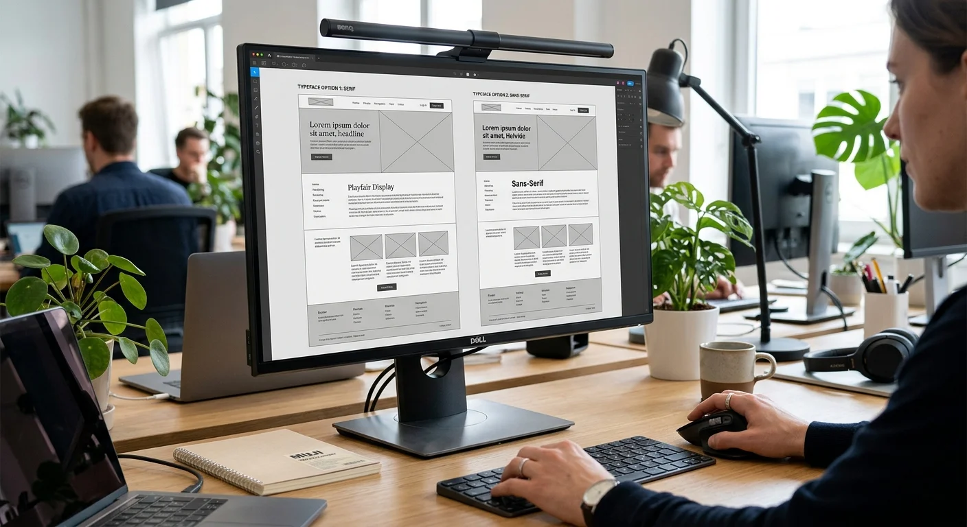
Consider the difference between a law firm’s website set in Comic Sans versus one set in a refined serif typeface like Playfair Display. The content might be identical, but the perception is worlds apart. Typography is not just decoration; it is a fundamental layer of your visual communication strategy.
Beyond perception, typography directly affects usability. If visitors cannot comfortably read your content, they will leave. According to studies by the Nielsen Norman Group, users read only about 20% of the text on an average web page. Making that 20% as readable and engaging as possible is critical for keeping people on your site and guiding them toward conversion. For more on how design influences user behaviour, see our guide on using smart web design to improve CRO.
Understanding Typeface Categories for the Web
Before you can choose the right typeface, you need to understand the major categories and what each communicates visually.
Serif Typefaces
Serif typefaces feature small decorative strokes (serifs) at the ends of letterforms. Think of fonts like Times New Roman, Georgia, Merriweather, and Lora. These typefaces carry associations with tradition, authority, elegance, and trustworthiness. They are popular choices for law firms, financial services, luxury brands, and editorial publications.
On the web, serifs have become increasingly readable thanks to high-resolution screens. Where once sans-serif fonts dominated digital interfaces due to screen limitations, modern displays render serif fonts beautifully. If your brand leans toward heritage, formality, or intellectual credibility, a serif typeface may be the right choice.
Sans-Serif Typefaces
Sans-serif typefaces lack those decorative strokes, resulting in clean, modern-looking letterforms. Popular web examples include Inter, Roboto, Open Sans, Lato, and Montserrat. These fonts communicate modernity, simplicity, friendliness, and efficiency.
Sans-serif fonts remain the most popular choice for digital interfaces, and for good reason. They tend to perform well at small sizes, are highly legible on screens of all resolutions, and project a contemporary feel. Technology companies, startups, healthcare providers, and e-commerce brands frequently use sans-serif typefaces.
Display and Decorative Typefaces
Display typefaces are designed for headlines and large text, not body copy. They include script fonts, slab serifs, hand-drawn styles, and other distinctive designs. While they can add personality and visual interest, they should be used sparingly. A display font works well for a hero headline or a logo, but using it for paragraphs of body text will frustrate readers.
Monospace Typefaces
Monospace fonts give each character the same width, creating a uniform, technical appearance. They are primarily used for code snippets and technical documentation. Unless your brand specifically targets developers or has a tech-forward identity, monospace fonts are best reserved for specialised content blocks rather than primary typography.
How Typeface Choice Affects Brand Perception
Your typeface is a silent ambassador for your brand. Research published in the journal Applied Cognitive Psychology found that fonts influence perceptions of a brand’s personality traits, including sincerity, excitement, competence, sophistication, and ruggedness. Here is how different type choices map to brand attributes:
- Trust and authority: Serif fonts like Georgia or Merriweather signal reliability and credibility.
- Innovation and modernity: Clean sans-serif fonts like Inter or Helvetica Neue project forward-thinking efficiency.
- Warmth and friendliness: Rounded sans-serif fonts like Nunito or Quicksand feel approachable and personable.
- Luxury and exclusivity: Thin, elegant serifs or high-contrast display fonts convey premium positioning.
- Playfulness and creativity: Hand-drawn or quirky display fonts suggest energy and originality.
When choosing a typeface, start by defining three to five brand personality traits. Then evaluate fonts against those traits. If your brand is “professional, trustworthy, and modern,” a geometric sans-serif like Outfit or a transitional serif like Source Serif Pro would be appropriate. If your brand is “creative, energetic, and bold,” you might lean toward a strong display font for headlines paired with a friendly sans-serif for body text.
Serif vs Sans-Serif for the Web: Making the Right Call
The serif versus sans-serif debate has been ongoing since the early days of web design. Here is the practical reality in 2026:
Readability on screens: Both serif and sans-serif fonts are highly readable on modern high-DPI screens. The old advice that “sans-serif is always better for screens” is outdated. What matters more than category is the specific font’s design quality, x-height, letter spacing, and weight options.
Mobile considerations: On smaller screens, fonts with a generous x-height and open letterforms tend to perform best regardless of category. Fonts like Source Serif 4 (serif) and Inter (sans-serif) are both excellent on mobile because they were designed with screen rendering in mind. For more on mobile design, read our guide to designing a mobile-friendly site.
Content type matters: Long-form editorial content often benefits from serif typefaces, which provide a familiar reading rhythm similar to print. Interface-heavy sites (dashboards, SaaS products, e-commerce) typically work better with sans-serif fonts that stay legible at small sizes across various UI elements.
Audience expectations: Consider your target audience. Australian corporate clients may expect serif typography that signals authority. A younger consumer audience might respond better to clean, modern sans-serif type. There is no universal right answer; the best choice aligns with your specific audience’s expectations and your brand identity.
Font Pairing Strategies That Work
Most professional websites use at least two typefaces: one for headings and one for body text. Effective font pairing creates visual hierarchy, adds interest, and guides the reader’s eye through your content. Here are proven strategies for pairing fonts successfully.
1. Contrast with Complement
The most reliable pairing approach is to combine a distinctive heading font with a neutral body font. The heading font provides personality and visual impact, while the body font stays out of the way and prioritises readability. For example:
- Playfair Display (serif heading) + Source Sans 3 (sans-serif body)
- Montserrat (geometric sans-serif heading) + Merriweather (serif body)
- DM Serif Display (display heading) + Inter (sans-serif body)
2. Superfamily Pairing
Some type families include both serif and sans-serif versions designed to work together. Examples include IBM Plex (Serif, Sans, Mono), Noto (Serif, Sans), and Source (Source Serif, Source Sans). These pairings are virtually foolproof because the fonts share underlying proportions and design DNA.
3. Weight and Style Variation Within One Family
For a minimalist, cohesive look, use a single versatile font family and create hierarchy through weight, size, and colour variation. A font like Inter with its range of weights from Thin to Black can handle headings, body text, captions, and UI elements while maintaining perfect harmony. This approach also benefits performance since you are loading only one font family.
4. Rules for Successful Pairing
- Limit yourself to two or three typefaces maximum. More than that creates visual chaos.
- Ensure sufficient contrast. Two similar sans-serif fonts will look like a mistake rather than a design choice.
- Match the mood. Both fonts should align with your brand personality, even if they differ in style.
- Test at multiple sizes. A pairing that works at desktop heading sizes might not work when scaled down for mobile.
- Check character sets. If your content requires special characters, currency symbols, or diacritics, ensure both fonts support them.
Web Font Performance: Speed Matters
Beautiful typography means nothing if it slows your website to a crawl. Web fonts add HTTP requests and file weight to your pages, which directly impacts load time and Core Web Vitals scores. Here is how to keep your typography looking great without sacrificing performance.
Minimise Font Files
Every font weight and style you load is an additional file. If you are using Inter in Regular, Medium, Semi-Bold, Bold, and Italic variants, that is five separate font files. Be disciplined about which weights you actually need. Most sites can get by with two to three weights per font family (regular, medium or semi-bold, and bold).
Use Modern Font Formats
WOFF2 is the current standard for web fonts, offering significantly better compression than older formats like WOFF or TTF. All modern browsers support WOFF2, so there is little reason to serve other formats unless you need to support legacy browsers. A single WOFF2 file can be 30-50% smaller than its WOFF equivalent.
Self-Host vs Google Fonts
Google Fonts is convenient, but self-hosting your web fonts offers performance advantages. When you self-host, you eliminate a third-party DNS lookup and connection, you can apply optimal caching headers, and you have full control over which subsets and weights to include. Tools like google-webfonts-helper make it straightforward to download Google Fonts for self-hosting.
If you are using a CMS like WordPress, many modern themes and plugins support self-hosted fonts out of the box. For guidance on choosing the right platform, see our comparison of content management systems.
Implement font-display: swap
The CSS font-display: swap property tells browsers to show text immediately using a fallback font, then swap in the web font once it has loaded. This prevents the “flash of invisible text” (FOIT) where users see blank space while fonts load. While there is a brief flash of unstyled text (FOUT), this is far preferable to invisible content.
Preload Critical Fonts
For your most important font files (typically the body text font in regular weight), use the <link rel="preload"> tag in your HTML head. This tells the browser to start downloading the font early, before it encounters the CSS that references it, reducing the time to first render with the correct typography.
Typography and Accessibility: Designing for Everyone
Accessible typography is not just a legal consideration under Australian accessibility guidelines; it is good business practice. Roughly one in five Australians has a disability, and many more experience situational accessibility challenges like reading on a phone in bright sunlight. Here are the key accessibility considerations for web typography.
Font Size
Body text should be at least 16 pixels (1rem) as a base size. Many modern sites use 18px or even 20px for body copy, which improves readability for everyone. Heading sizes should follow a clear typographic scale, such as the Major Third (1.25 ratio) or Perfect Fourth (1.333 ratio), to create predictable visual hierarchy.
Line Height and Spacing
Body text should have a line height (leading) of at least 1.5 times the font size. This gives readers enough vertical space to track from line to line without getting lost. Paragraph spacing should be generous enough to create clear content breaks. Letter spacing (tracking) should not be overly compressed, particularly for body text.
Colour Contrast
WCAG 2.2 guidelines require a minimum contrast ratio of 4.5:1 for normal text and 3:1 for large text (18px bold or 24px regular). Many designers favour light grey text for aesthetic reasons, but this often fails contrast requirements. Use tools like the WebAIM Contrast Checker to verify your text colour against its background. For more on optimising your site’s usability, explore our guide to optimising your website’s user experience.
Line Length
Optimal line length for readability is 50 to 75 characters per line, including spaces. Lines that are too long make it difficult for readers to find the beginning of the next line. Lines that are too short create a choppy reading experience. Use CSS max-width on your text containers to control line length regardless of screen size.
Font Choice and Legibility
Some typefaces are inherently more legible than others. Look for fonts with clearly distinct letterforms, particularly for characters that are easily confused: uppercase I, lowercase l, and the number 1; uppercase O and the number 0. Fonts designed specifically for screen use, like Atkinson Hyperlegible, prioritise these distinctions.
A Step-by-Step Process for Choosing Your Website Typeface
Now that you understand the theory, here is a practical process you can follow to select the right typeface for your website.
Step 1: Define Your Brand Personality
Write down three to five adjectives that describe your brand. Are you professional, innovative, and trustworthy? Or playful, energetic, and bold? These descriptors will guide every typographic decision you make.
Step 2: Study Your Competitors
Look at the typography used by competitors and brands you admire. Tools like WhatFont (a browser extension) let you identify fonts on any website. Note what works, what does not, and where you can differentiate. You do not want to look identical to your competitors, but you also need to meet the baseline expectations of your industry.
Step 3: Choose Your Body Font First
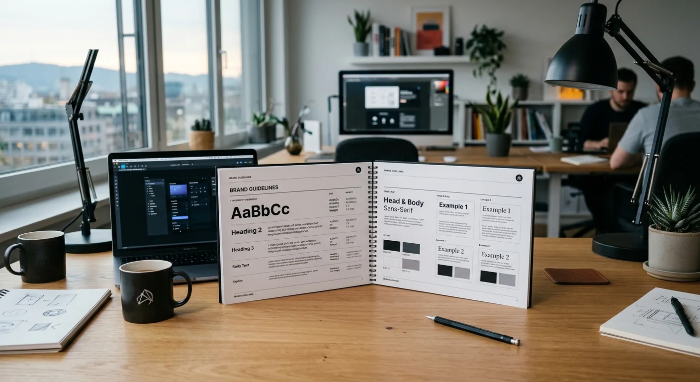
Body text accounts for the majority of the content on your site, so it should be your primary consideration. Choose a font that is highly readable at paragraph sizes, offers the weights you need, and aligns with your brand personality. Test it with real content, not just lorem ipsum.
Step 4: Select a Complementary Heading Font
With your body font established, find a heading font that creates visual contrast while maintaining stylistic harmony. Use the pairing strategies discussed earlier: contrast with complement, superfamily, or single-family variation.
Step 5: Test Across Devices and Contexts
View your chosen fonts on desktop, tablet, and mobile screens. Check them in different browsers. Test with long-form content, short UI labels, navigation menus, and form elements. A font that looks stunning in a Figma mockup might reveal issues at certain sizes or on specific devices.
Step 6: Verify Performance and Licensing
Before committing to a font, check its file size and loading impact. Also verify the licensing terms. Google Fonts are free for commercial use, but many premium fonts require purchased licences for web use. Budget for font licensing if you are going the premium route; quality typography is worth the investment.
Top Web Font Recommendations for 2026
Here are some of the best-performing, most versatile web fonts available right now, all free to use via Google Fonts or similar open-source libraries:
Best Sans-Serif Fonts for Body Text
- Inter: Designed specifically for computer screens, with excellent readability at all sizes and a comprehensive character set.
- Source Sans 3: Adobe’s open-source workhorse. Clean, professional, and available in a wide range of weights.
- DM Sans: A geometric sans-serif with a friendly feel and strong legibility credentials.
Best Serif Fonts for Body Text
- Source Serif 4: The serif counterpart to Source Sans, designed for long-form reading on screens.
- Merriweather: Specifically designed for screen readability with generous x-height and open forms.
- Lora: A well-balanced serif with roots in calligraphy, ideal for editorial and literary content.
Best Heading and Display Fonts
- Playfair Display: A high-contrast serif with an elegant, editorial quality.
- Montserrat: A bold geometric sans-serif inspired by Buenos Aires signage, excellent for impactful headlines.
- Space Grotesk: A modern, slightly quirky sans-serif that adds character without sacrificing professionalism.
Common Typography Mistakes to Avoid
Even experienced designers can fall into typography traps. Watch out for these common pitfalls:
- Using too many fonts. Stick to two, or at most three. Every additional font adds visual noise and download weight.
- Ignoring font loading performance. Beautiful typography that causes layout shift or slow page loads will hurt your website optimisation efforts.
- Centering long paragraphs. Centre alignment works for short headings but makes body text extremely difficult to read.
- Insufficient line height. Cramped text is tiring to read and signals a lack of design polish.
- Not testing on real devices. A font that renders beautifully on a Retina MacBook may look rough on a budget Android phone.
- Relying on system fonts without intention. System font stacks (like -apple-system, BlinkMacSystemFont) can be a valid performance-first choice, but they should be deliberate, not accidental.
Typography as Part of Your Broader Design System
Your typeface choices should not exist in isolation. They need to work within a coherent design system that includes colour, spacing, imagery, and layout. Create a typographic scale that defines specific sizes, weights, and line heights for each level of content: H1 through H6, body text, small text, captions, and labels.
Document these specifications so that every page and every piece of content maintains consistency. Inconsistent typography across a website is one of the quickest ways to undermine user trust. For more on building effective, conversion-focused websites, explore our tips on designing high-converting landing pages.
Final Thoughts
Choosing the right typeface for your website is a decision that touches brand identity, user experience, accessibility, and technical performance. It is not a decision to make lightly or based on personal preference alone. By understanding the fundamentals of type categories, brand alignment, font pairing, performance optimisation, and accessibility, you can make typography choices that strengthen your website and support your business goals.
Take the time to test options, gather feedback, and refine your choices. Great typography is invisible in the best sense: it lets your content shine without drawing attention to itself. When you get it right, your visitors will enjoy a smoother, more professional experience, and your brand will be stronger for it.
Need expert help with your website’s design and typography? PWD is an Australian digital agency specialising in web design, development, and digital marketing. Get in touch with our team to discuss how we can help you create a website that looks exceptional and performs brilliantly.
Does my website typeface really affect conversions?
Yes. Typography influences readability, trust, and overall user experience, all of which directly impact conversion rates. Studies show that visitors form opinions about a website within milliseconds, and typeface is a major factor in that first impression. A well-chosen typeface keeps users engaged and guides them toward taking action.
Should I use serif or sans-serif fonts for my website?
It depends on your brand personality and content type. Sans-serif fonts are popular for modern, clean interfaces and e-commerce sites. Serif fonts work well for editorial content and brands that want to convey tradition or authority. Modern high-resolution screens render both categories beautifully, so base your decision on brand alignment rather than outdated screen readability myths.
How many fonts should I use on my website?
Stick to a maximum of two or three typefaces. Using more than that creates visual clutter and increases page load time. Most effective websites use one font for headings and another for body text, with hierarchy created through size, weight, and colour variation.
Are Google Fonts good enough for a professional website?
Absolutely. Google Fonts offers hundreds of high-quality, professionally designed typefaces that are free for commercial use. Fonts like Inter, Source Sans 3, and Merriweather are used by major brands worldwide. For best performance, consider self-hosting Google Fonts rather than loading them from Google’s servers.
How do web fonts affect my website’s page speed?
Each font file you load adds to your page weight and requires an HTTP request. A single font weight in WOFF2 format typically ranges from 15 to 50 KB. To minimise impact, limit the number of weights you load, use WOFF2 format, implement font-display swap in your CSS, and consider preloading critical font files.
What is the best font size for body text on a website?
The recommended minimum body text size is 16 pixels (1rem), but many modern sites use 18px or 20px for improved readability. The best size depends on your chosen typeface, line length, and audience. Always test with real content on actual devices to find the optimal size for your specific design.