
Google’s data reveals that 80% of consumers use search for local information on mobile devices. Yet many businesses still struggle with mobile search rankings, missing out on this massive traffic opportunity. Mobile traffic now exceeds desktop usage globally, and Google treats mobile-friendliness as a critical ranking factor.
If your site isn’t optimised for mobile devices, you’re losing customers to competitors who are. This guide covers everything you need to know about mobile SEO: from responsive design implementation to local search optimisation and site speed improvements. Each strategy delivers measurable results when applied correctly.
Why Mobile SEO Is Essential for Your Business
Mobile SEO means optimising your website to rank higher in mobile search results whilst delivering an excellent user experience across all devices. The shift to mobile-first isn’t coming – it’s already happened. Here’s why mobile SEO demands your immediate attention:
Mobile Traffic Now Dominates Desktop
We’ve crossed a critical threshold where global mobile traffic has overtaken desktop usage. The numbers tell a clear story: more people search on phones than computers. Google processes over 93% of mobile search traffic, making their mobile algorithms the primary gateway to your customers.
This shift changes everything about how you approach SEO strategy. Your mobile experience isn’t secondary – it’s primary.
Google’s Mobile-First Index Changes Everything
Google’s announcement about mobile-friendliness as a ranking factor wasn’t subtle: “This change will affect mobile searches in all languages worldwide and will have a significant impact on our search results.” They’ve moved to mobile-first indexing, meaning Google predominantly uses your mobile site version for ranking and indexing.
Sites without mobile optimisation rank lower in search results. That’s not speculation – it’s algorithmic fact. Your desktop site could be perfect, but if your mobile experience fails, your rankings suffer.
Mobile Users Have Zero Patience
Google’s research shows 65% of users prefer buying from mobile-friendly sites, whilst 59% abandon sites where they can’t find what they need quickly. Mobile users operate in high-intent, low-patience mode. They want answers immediately, not after struggling with poor navigation or slow loading.
For more detail, see our guide on designing a mobile-friendly site.
Most websites still haven’t adapted to mobile properly. This creates opportunity – getting mobile SEO right gives you immediate competitive advantage over businesses still treating mobile as an afterthought.
Mobile Web Design Configurations That Work
Desktop websites rarely translate well to mobile screens without specific optimisation. Success depends on choosing the right mobile configuration. You have three main options, but only one gets our strong recommendation:
Responsive Design (Recommended)
Responsive design uses flexible grids that automatically adjust to any screen size. Users get the same HTML code and content URL whether they’re on desktop, smartphone, or tablet. The layout adapts seamlessly.

This is Google’s preferred approach. One URL makes crawling and indexing straightforward, and you only manage one version of your content.
Dynamic Serving
Dynamic serving uses the same URL but delivers different HTML and CSS based on the user’s device. Server-side detection determines what content to serve. While functional, this approach requires more technical SEO expertise to implement correctly.
Separate URLs (Not Recommended)
This involves creating distinct URLs – typically www.yoursite.com for desktop and m.yoursite.com for mobile. Users get different code based on their device. The major drawback: maintaining two separate sites doubles your workload and creates potential SEO issues.
Test your site’s mobile-friendliness using Google’s Mobile-Friendly Test tool. Enter your URL and hit “Run Test”. If you see warnings about mobile issues, it’s time to act.
Implementing Responsive Design Properly
Responsive design solves the multi-device challenge by automatically adapting to provide optimal viewing across all screen sizes. Here’s how to implement it effectively:
Set the Viewport Meta Tag
The viewport meta tag tells browsers how to control page dimensions and scaling. Without it, mobile browsers render pages at desktop width, forcing users to pinch and zoom.
Add this tag to all your pages:
<meta name="viewport" content="width=device-width, initial-scale=1">Make Content Fit the Viewport
Content must fit within the viewport without horizontal scrolling. Fixed-width elements wider than the screen create terrible user experiences. Users shouldn’t need to scroll sideways or zoom out to see your content.
Make images responsive with CSS:
<img src="img.jpg" style="width:100%; height:auto;">Use CSS Media Queries
Media queries apply different CSS styles based on device characteristics like screen width. This creates breakpoints where your design adapts for different screen sizes, giving you precise control over how content displays across devices.
Many content management systems offer responsive themes out of the box. WordPress provides numerous responsive themes that handle the technical implementation for you.

Boosting Mobile Site Speed for Better Rankings
Site speed directly impacts both user experience and search rankings. Google’s research reveals the relationship between mobile loading times and bounce rates: as load time increases from 1 to 3 seconds, bounce probability increases by 32%. At 5 seconds, it jumps to 90%.
Every additional second of loading time costs you customers. High bounce rates hurt conversions and signal poor quality to search engines. Site speed is a confirmed ranking factor, so slow sites rank lower in mobile results.
Use Google’s PageSpeed Insights to audit your mobile performance. The tool provides specific recommendations for improvement.
Optimise Images Aggressively
Large images slow down mobile loading significantly. Compress images before uploading using tools like ImageOptim or TinyPNG. For WordPress sites, plugins like Smush or ShortPixel handle compression automatically.
Modern image formats like WebP provide better compression than traditional JPEGs while maintaining quality.
Enable Browser Caching
Browser caching stores static files locally so pages load faster on repeat visits. Google recommends minimum cache times of one week, preferably up to one year for static elements.
WordPress caching plugins like W3 Total Cache or WP Rocket handle this automatically. For custom sites, configure caching through your .htaccess file.
Minify CSS and JavaScript
Minification removes unnecessary characters and combines files to reduce loading time. Fewer HTTP requests mean faster mobile performance. Most caching plugins include minification features.
Consider a Content Delivery Network
CDNs serve content from servers closest to your users, dramatically reducing loading times. Services like Cloudflare offer free CDN options that can improve mobile performance immediately.
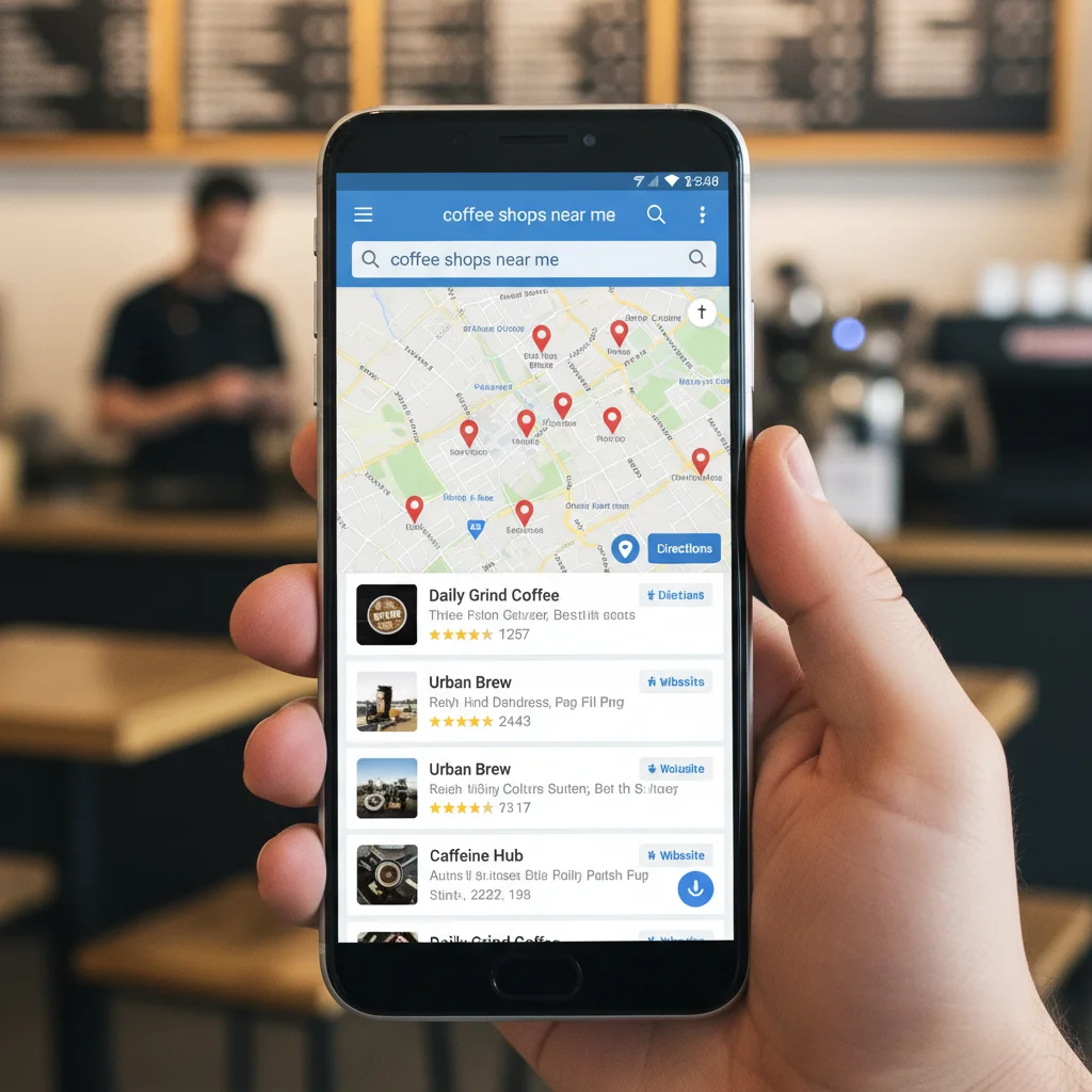
Mastering Local Search for Mobile Users
Mobile devices drive local search behaviour. People use phones to find nearby businesses, check opening hours, and get directions. Google’s data shows 80% of consumers use search for local information, and 50% of smartphone users visit a store within a day of their local search.
Local search captures high-intent traffic – people ready to buy, visit, or contact businesses. Local SEO optimisation positions your business in front of these ready-to-convert users.
Optimise Critical On-Page Elements
Start with these essential on-page factors:
- Titles: Include target keywords plus location (“Plumbing Services in Brunswick”). Keep under 60 characters for proper mobile display.
- Headers: Use H2 and H3 tags with local keywords and related phrases. One H1 per page maximum.
- NAP Details: Display Name, Address, Phone Number consistently across all pages. Make them easily clickable on mobile.
- Content: Create location-specific content that serves your local audience. Answer questions people in your area actually ask.

Build Local Citations Strategically
Citations (mentions of your business name online) impact local search rankings. They help users discover your business and signal legitimacy to search engines.
Start with Google My Business – it’s the most important local platform. Complete every section of your profile and verify your business ownership. Then expand to relevant local directories and industry-specific sites.
Keep NAP information identical across all citations. Inconsistent information confuses search engines and weakens your local authority.
Earn Quality Local Links
Links remain critical for mobile SEO success. Focus on earning links from local and industry-relevant sources:
- Local partnerships: Collaborate with complementary local businesses
- Community involvement: Sponsor local events or charities
- Local content creation: Write about local topics that attract natural links
- Industry recognition: Pursue awards and certifications in your field
Quality beats quantity. One link from a respected local publication carries more weight than dozens from low-quality directories.
Using Structured Data for Mobile Success
Structured data helps search engines understand your content better and can trigger rich snippets in search results. While it may not directly boost rankings, it significantly improves click-through rates by making your listings more appealing.
Schema.org provides vocabulary for marking up different content types including articles, restaurants, reviews, events, products, and local businesses.

Implement Schema Markup
Google’s Structured Data Markup Helper simplifies implementation. Select your content type, enter your URL, then highlight page elements to mark up. The tool generates the necessary code for you to add to your site.
For local businesses, focus on LocalBusiness schema including:
- Business name and address
- Phone number and opening hours
- Service areas and business type
- Customer reviews and ratings
Use Google’s Structured Data Testing Tool to verify your markup works correctly before going live.
Mobile UX Best Practices That Drive Results
Technical optimisation means nothing if users can’t navigate your site effectively. Mobile user experience directly impacts both rankings and conversions. Great UX design keeps users engaged and signals quality to search engines.
Essential Mobile UX Guidelines
- Eliminate Flash: Flash doesn’t work on many mobile browsers. Use HTML5 or CSS animations instead.
- Remove intrusive pop-ups: Google penalises sites with interstitials that block content on mobile. Avoid them entirely.
- Keep resources crawlable: Don’t block search engines from accessing CSS, JavaScript, or other critical files.
- Size tap targets properly: Buttons and links need adequate spacing. Minimum 44px touch targets prevent accidental taps.
- Use readable fonts: Text should be legible without zooming. 16px is the minimum for body text.
Google Search Console’s Mobile Usability Report identifies specific issues affecting your mobile site. Address these warnings to improve user experience and search performance.

Mobile-Specific Navigation Design
Mobile navigation requires different thinking than desktop menus. Hamburger menus work well when designed clearly. Priority navigation items should be immediately visible. Consider sticky navigation for easy access to key pages.
Test your site on actual mobile devices, not just browser resize tools. Real-world testing reveals issues that desktop testing misses.
Advanced Mobile SEO Strategies
Once you’ve mastered the fundamentals, these advanced techniques can push your mobile SEO performance further:
Accelerated Mobile Pages (AMP)
AMP creates ultra-fast loading versions of your pages. While not required for good mobile SEO, AMP can provide speed advantages for content-heavy sites. News sites and blogs see the biggest benefits.
Progressive Web Apps (PWAs)
PWAs combine website functionality with app-like experiences. They work offline, send push notifications, and install on home screens. For businesses with high mobile engagement, PWAs can improve user retention significantly.
Voice Search Optimisation
Mobile users increasingly use voice search. Optimise for conversational queries and question-based keywords. Featured snippets often provide voice search answers, making snippet optimisation more valuable.
Focus on long-tail keywords that match natural speech patterns. “What’s the best plumber near me?” rather than “plumber Perth”.
Measuring Mobile SEO Success
Track these key metrics to measure your mobile SEO performance:
- Mobile organic traffic: Monitor mobile search traffic growth in Google Analytics
- Mobile bounce rate: Lower bounce rates indicate better user experience
- Page load speed: Use PageSpeed Insights and Core Web Vitals data
- Mobile rankings: Track keyword positions in mobile search results
- Local pack appearances: Monitor visibility in local search results
Set up mobile-specific goals in Google Analytics to track conversions from mobile traffic. This helps you understand which mobile optimisation efforts deliver the best ROI.
Mobile traffic continues growing exponentially with no signs of slowing. Getting mobile SEO right isn’t optional – it’s essential for competing online. Implement these strategies systematically, starting with responsive design and site speed, then expanding to local optimisation and advanced techniques.
Need help implementing these mobile SEO strategies for your business? PWD Digital Agency specialises in mobile SEO optimisation that drives real results. Our team can audit your current mobile performance and develop a strategy to capture more targeted mobile traffic.
How long does it take to see results from mobile SEO?
Most mobile SEO improvements show initial results within 2-4 weeks. Site speed enhancements and mobile-friendly design changes can improve user experience immediately, whilst ranking improvements typically take 3-6 months depending on competition and current site status.
Is responsive design better than having a separate mobile site?
Yes, responsive design is Google’s recommended approach. It’s easier to maintain, prevents duplicate content issues, and ensures consistent user experience. Separate mobile sites (m. subdomain) create additional maintenance overhead and potential SEO complications.
What’s the ideal mobile page load speed?
Google recommends mobile pages load within 3 seconds or less. Pages loading in under 2 seconds provide the best user experience. Use Google PageSpeed Insights to test your current speed and get specific optimisation recommendations.
Do I need AMP for good mobile SEO?
AMP isn’t required for mobile SEO success. A well-optimised responsive site often performs just as well. AMP benefits content-heavy sites like news publications, but most businesses achieve better results focusing on responsive design and speed optimisation.
How important is local SEO for mobile search?
Local SEO is critical for mobile success. 80% of local searches happen on mobile devices, and 50% of mobile users visit stores within 24 hours. Optimising for local search, including Google My Business, can significantly increase foot traffic and phone enquiries.
Frequently Asked Questions
How long does it take to see results from mobile SEO?
Most mobile SEO improvements show initial results within 2-4 weeks. Site speed enhancements and mobile-friendly design changes can improve user experience immediately, whilst ranking improvements typically take 3-6 months depending on competition and current site status.
Is responsive design better than having a separate mobile site?
Yes, responsive design is Google’s recommended approach. It’s easier to maintain, prevents duplicate content issues, and ensures consistent user experience. Separate mobile sites (m. subdomain) create additional maintenance overhead and potential SEO complications.
What’s the ideal mobile page load speed?
Google recommends mobile pages load within 3 seconds or less. Pages loading in under 2 seconds provide the best user experience. Use Google PageSpeed Insights to test your current speed and get specific optimisation recommendations.
Do I need AMP for good mobile SEO?
AMP isn’t required for mobile SEO success. A well-optimised responsive site often performs just as well. AMP benefits content-heavy sites like news publications, but most businesses achieve better results focusing on responsive design and speed optimisation.
How important is local SEO for mobile search?
Local SEO is critical for mobile success. 80% of local searches happen on mobile devices, and 50% of mobile users visit stores within 24 hours. Optimising for local search, including Google My Business, can significantly increase foot traffic and phone enquiries.