How to Design High Converting Landing Pages
SEO (search engine marketing) is an absolutely indispensable part of any marketing campaign. Ranking for relevant queries positions your brand in front of prospects ready to buy. That kind of visibility means a serious competitive advantage for your business.
But even top rankings won’t guarantee sales.
Landing pages that fail to communicate the value of your products or services often translate to weak conversions. Nailing these pages down is the key then to fully unlocking the potential of your site.
Let’s cover the basics:
What is a Landing Page? A landing page is simply a page that visitors “land on”, typically from a marketing campaign such as Google AdWords. These are generally designed for specific goals such as:
- Generating newsletter sign-ups
- Capturing visitor information
- Increasing product sales
- Offering free trials or demos
Here’s an example of how landing pages are typically structured:
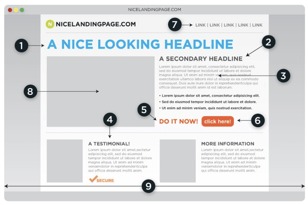
Too often companies send advertising traffic to their homepage but this is a major misstep. Homepages are often poorly targeted and tend to be too general. Clicking out requires far less effort than figuring out what to do next so that’s exactly visitors do. In contrast, targeted landing pages enable you to convert a higher percentage of your visitors into leads.
The following graph shows the impact that the quantity of landing pages has on lead generation:
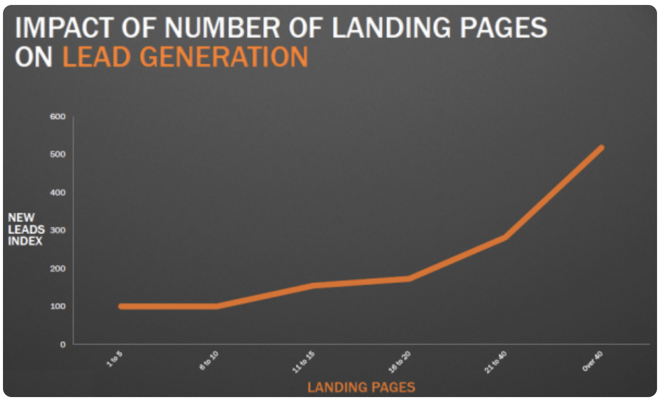
Increasing the number of landing pages from 1-5 to 6-10 didn’t show much of an increase. But companies saw a 55% increase in leads when they increased the number of landing pages to 11-15 and beyond.
Bottom line: Landing pages work.
More pages mean more opportunities to target your audience. But focusing solely on quantity is a recipe for disaster. Simply throwing up as many random pages as possible will likely do more harm than good. At the same you’re limiting your sales potential by only having a handful of landing pages.
Here we’ll look at how to design landing pages that convert.
1. Prioritise Content Above the Fold
The “fold” refers to the portion of the page that is visible without scrolling. It represents the part that visitors immediately see on a landing page. Scrolling is largely embedded into how users interact with websites but there’s an important caveat: There has to be a good incentive for visitors to scroll.
Data shows that the 57% of time spent on a page takes place above the fold.
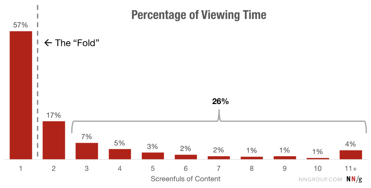
Portions of a page get less attention from users the further down it is. The key to driving conversions then is to prioritise content above the fold.
Be sure that the following elements are clearly visible when designing your landing page:
Headline A strong headline is a must. It’s one of the first things that visitors see and can mean the difference between users staying on to learn more or bouncing out. Your headline should have a clear value proposition and convey a benefit that audience can easily relate to.
Here’s an example of a good headline from CrazyEgg:
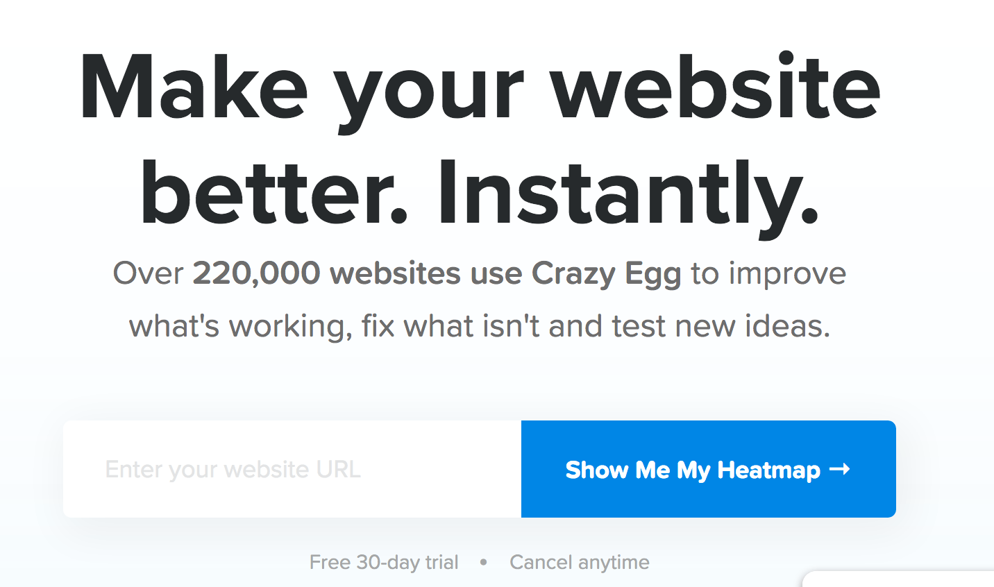
The headline works because the value proposition is clear and direct without any confusion. Of course, you’ll want to test different headlines as even a small change can mean more conversions.
Subheadline A strong headline reels grabs your user’s attention. Next, you want to lure them in further with a subheadline that elaborates more on your headline. Examples include emphasizing additional benefits and encouraging users to take action right away.
Here’s an example from Evernote:
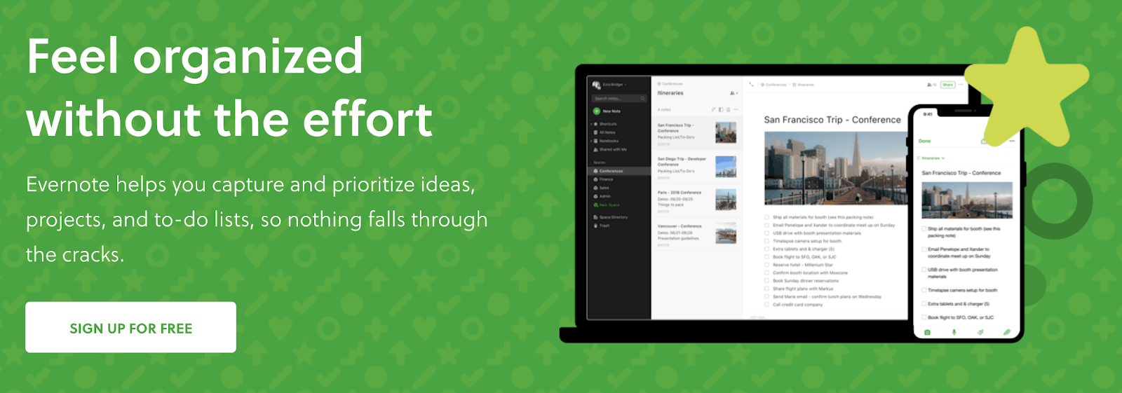
Subheadlines are typically longer in length but you don’t want to go overboard either. The idea is to get users to stay on your page long enough to act on your call to action.
Images Images are another must have component on landing pages. The images you use matter though as data shows that users ignore stock photos. Instead, you’ll want to invest in professional images that convey positive emotional benefits. Adding context also helps give prospects a better visual representation of your products or services.
Here’s an example of an image that Freshbooks uses:
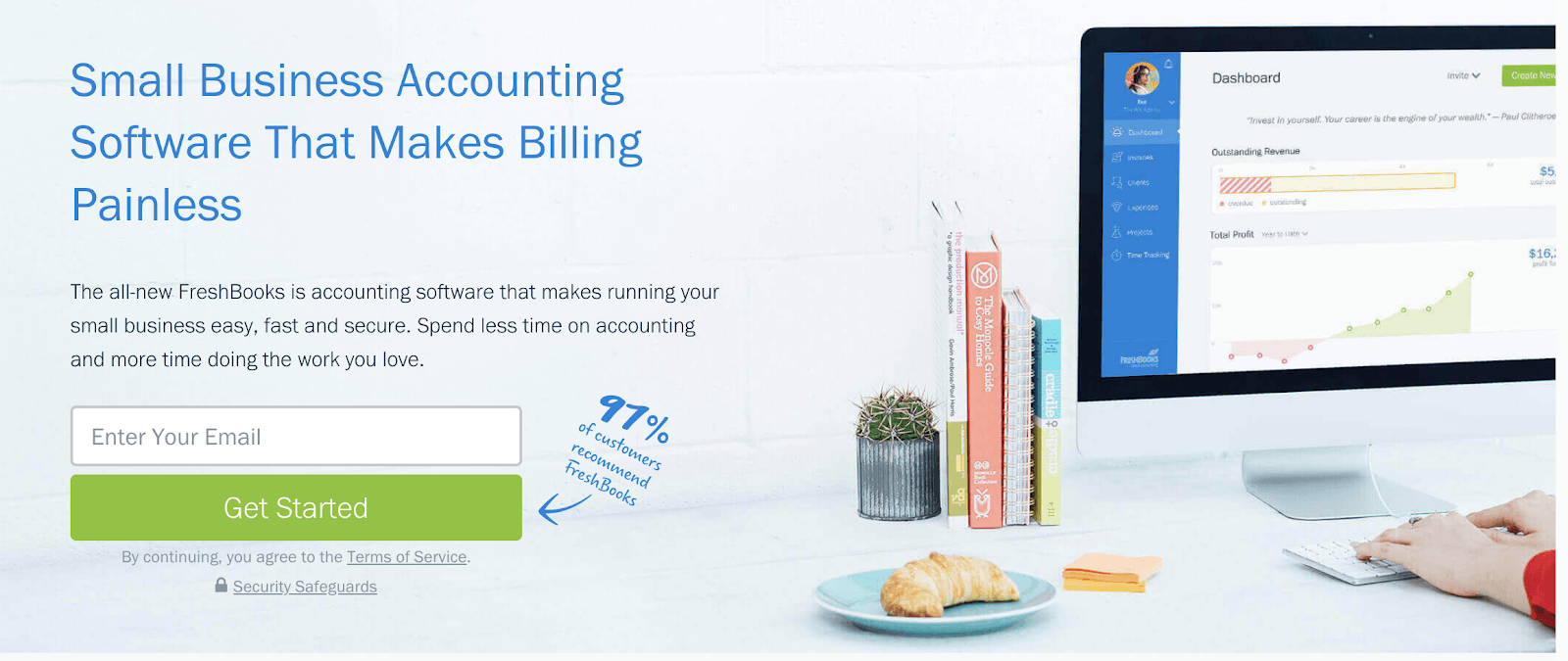
The image works well here as it illustrates the product in use and its context. Think about the images you use on your own landing pages and be sure to test.
Call to Action The whole point of a landing page is to drive conversions. And you do that with a call to action—A prompt in the form of a button or text. All the examples above include clear CTAs that encourage visitors to take action right away. Each also only has ONE conversion goal: To generate leads for the company.
Just like with the rest of the elements on your landing page, you’ll want to test different aspects of your CTA as even a small change can lead to more sales.
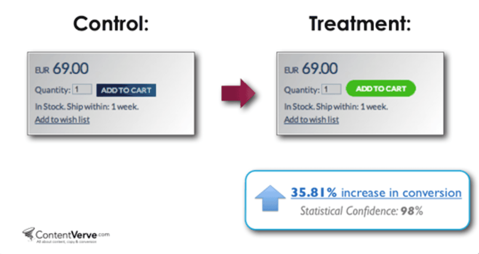
Content above the fold matters so make it count by ensuring these vital components are all visible.
2. Follow an F-Shaped Pattern Think about your own browsing habits. Chances are you scan rather than read every word on new pages you land on. Eyetracking studies confirm this behaviour as data shows that users tend to follow an F-shaped pattern when browsing the web.
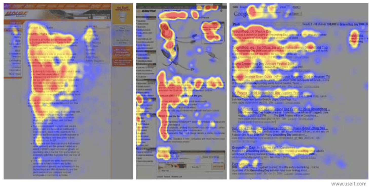
Another study has also found that the average visit typically lasts between 10 to 20 seconds. The implications of both are clear: Your landing pages need to facilitate scanning.
Here’s how:
Use Headlines and Subheadlines Headlines and subheadlines are effective at neatly dividing a landing page into clear sections (e.g. features, pricing, etc.). This makes it easier for users to find the relevant information as headlines tend to be more prominent. But don’t just stop there: Spruce up your headlines with clear value propositions to make them more persuasive.
Here’s an example of how Xero conveys benefits with its headlines:
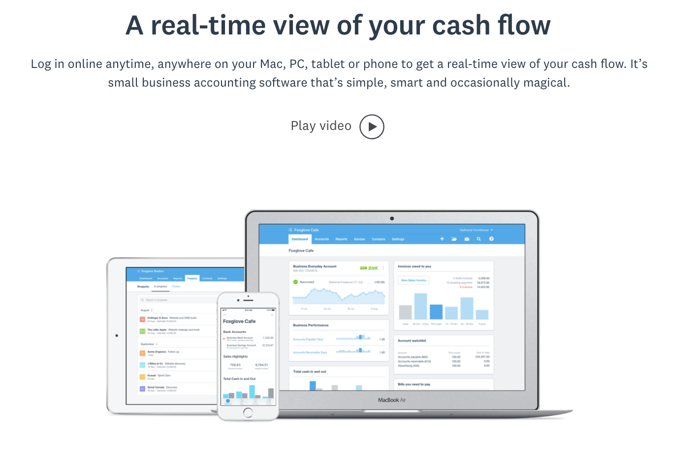
Value driven headlines are more effective than generic ones. So think of ways to communicate more value with your headlines rather than simply writing “Features”.
Use Bullet Points Large blocks of text can be rather overwhelming. Consider the following sample paragraph:
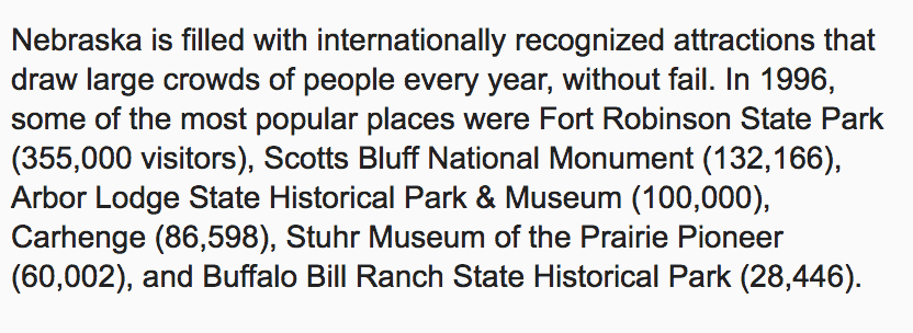 A better way to structure your content and improve readability is to use bullet points. Now here’s how that same paragraph but with some formatting:
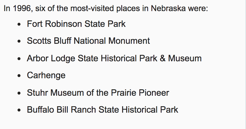
The text is much easier to read and not as cluttered. Data from the Nielsen Norman Group found that the above example with concise formatting resulted in 124% better usability. That’s a significant improvement and one that can ultimately mean more to your bottom line.
Implement White Space White space refers to the parts of a page that are left unused. It’s the empty space between images, text, and other elements. White space may be seen as a waste of screen real estate but it’s one of the most important design elements. Cluttered designs are difficult to navigate and send confusing signals to visitors.
Case in point:
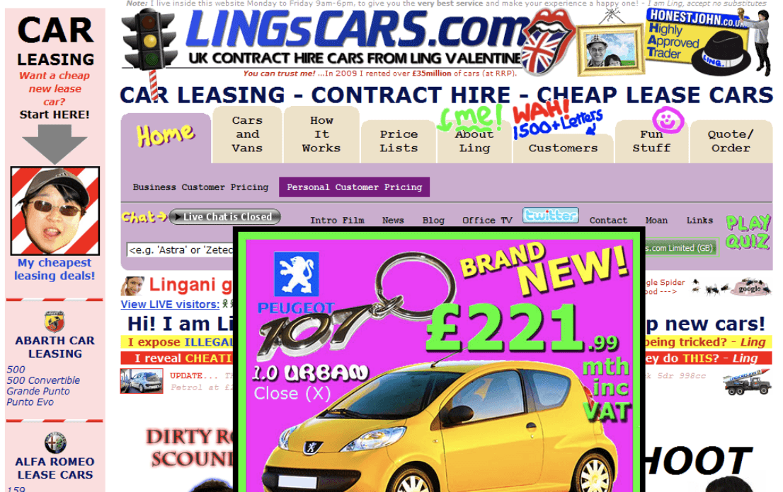
White space provides ample breathing room for your content and allows you to highlight key parts of the page such as your CTAs. Research has also shown that white space increases comprehension by almost 20%, a major
Dropbox uses plenty of white space on its business page:
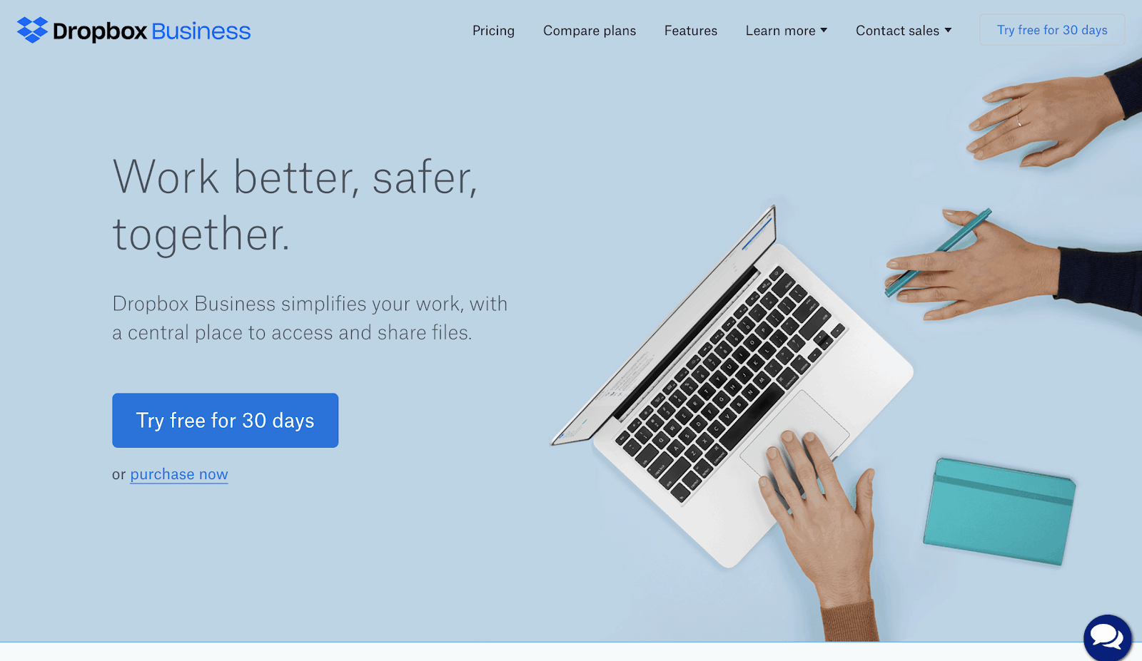
The difference between the two is worlds apart. A clean and simple layout will always beat out a cluttered design. So think about how you can include more whitespace in your own landing pages.
3. Implement Social Proof Think about the last time you shopped at a local business. Chances are that you did some background research first before making the trip out there.
A comprehensive survey from BrightLocal found that 93% of consumers read local reviews when deciding whether a business is good or not. The study highlights one key message: Consumers turn to the opinion of others to form their own.
This is a concept known as social proof—The psychological phenomenon where people turn to their immediate environment to guide their own.
If you see a venue that has a line going out the door, that tells you it must be a popular place which then increases its perceived value. But if a venue barely has customers inside, it’s a signal that maybe you should take your business elsewhere.
In a similar fashion, social proof can be leveraged to make your landing pages more persuasive and increase the perceived value of your products or services.
Here’s how:
Include Customer Testimonials Customer testimonials are one of the most powerful forms of social proof. They come directly from existing customers and often highlight a key function that makes their lives easier. That kind of feedback can often sway more prospects who were originally on the fence.
Here’s an example of how FreshBooks uses testimonials on its homepage: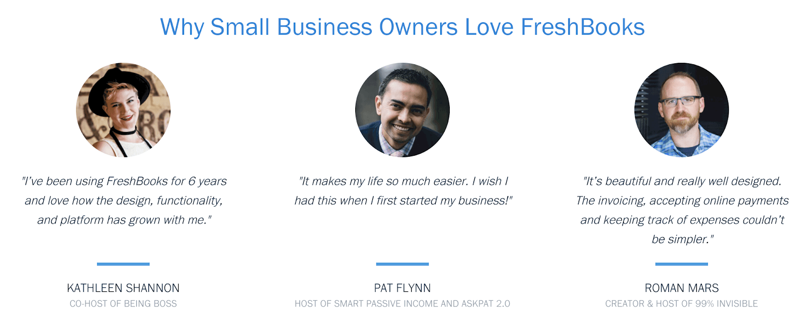
The testimonials come from actual business owners (the target audience) who have used the product to grow their own businesses. Be sure to accompany any customer testimonials with a snapshot of the individual and a short description of who they are to lend more credibility.
Highlight Case Studies Case studies are extremely effective as they highlight real results that customers have been able to achieve with a product or service. Because they tell a story, they tend to be far more engaging—A perfect combination to increase user interaction on your pages.
Here’s an example of how Xero implements case studies on its home page:

Xero does a great job of implementing this form of social proof on its homepage. Users can either watch the story or click through to read more stories. If you include case studies, be sure to get into specifics and detail exactly how users are benefiting from your products or services.
Include Clients Served Leveraging the credibility of other brands eases any doubts that prospects have. It shows that other companies use and rely on your business. The idea is to build trust with your visitors and make them feel more comfortable with their purchase.
Dropbox not only shows the number of companies it works with but also includes the logos of well recognised brands that use the service:
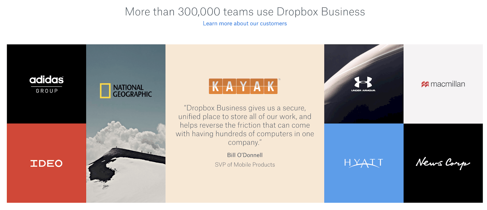
If your business has worked with reputable brands in the industry, don’t be afraid to highlight that fact as it will definitely work in your favour.
Conclusion Landing pages are a crucial component of any marketing campaign. It’s where prospects learn more about your products or services. How well your landing pages are designed can mean the difference between visitors clicking out or converting. Start by implementing each of the essentials detailed here. Be sure to always be testing as even the smallest changes can have a huge impact to your bottom line.
