Effective Call-to-Action Landing Page Examples for 2026

Running Google Ads campaigns that drive solid traffic but barely convert? You’ve tested headlines, tweaked budgets, and analysed every metric – yet your conversion rates remain stubbornly low. Before you blame your ad spend, examine what happens after the click.
The problem often lies in your call-to-action (CTA) buttons. These small but mighty elements determine whether visitors take action or bounce. A well-crafted CTA can transform a mediocre campaign into a conversion powerhouse.
Here’s how to design CTAs that actually convert visitors into customers.
Make Your CTA Button Impossible to Miss
Your CTA button needs to dominate the visual hierarchy of your landing page. Use contrasting colours that pop against your background and position the button above the fold where visitors see it immediately.
Take Dropbox Business as an example:
The bright blue button stands out immediately against the white background. Visitors know exactly what action to take without scrolling or searching. This visual clarity is what separates high-performing landing pages from the rest.
Write Copy That Sells Benefits, Not Features
“Click here” and “Submit” are conversion killers. Your CTA copy should tell visitors exactly what value they’ll receive when they click. Use action verbs that create urgency and highlight the benefit they’ll get.
Unbounce’s “Get More Conversions” button works because it promises a specific outcome visitors want. The copy is direct and benefit-focused. When crafting your ad copy and landing page content, always lead with what the visitor gains, not what they need to do.
Build Trust With Specific Numbers
Vague claims like “thousands of satisfied customers” don’t convert. Specific numbers add credibility and social proof that pushes hesitant visitors over the line. When prospects see concrete evidence of your success, they’re more likely to trust your offer.
AWeber’s landing page immediately establishes credibility by mentioning their 100,000+ marketers. This specific number provides social proof that their service works. The CTA button “Sign Up Free” removes risk while the headline builds trust.
Just like with your digital marketing metrics, specificity beats generality every time.
Remove Risk From Every Transaction
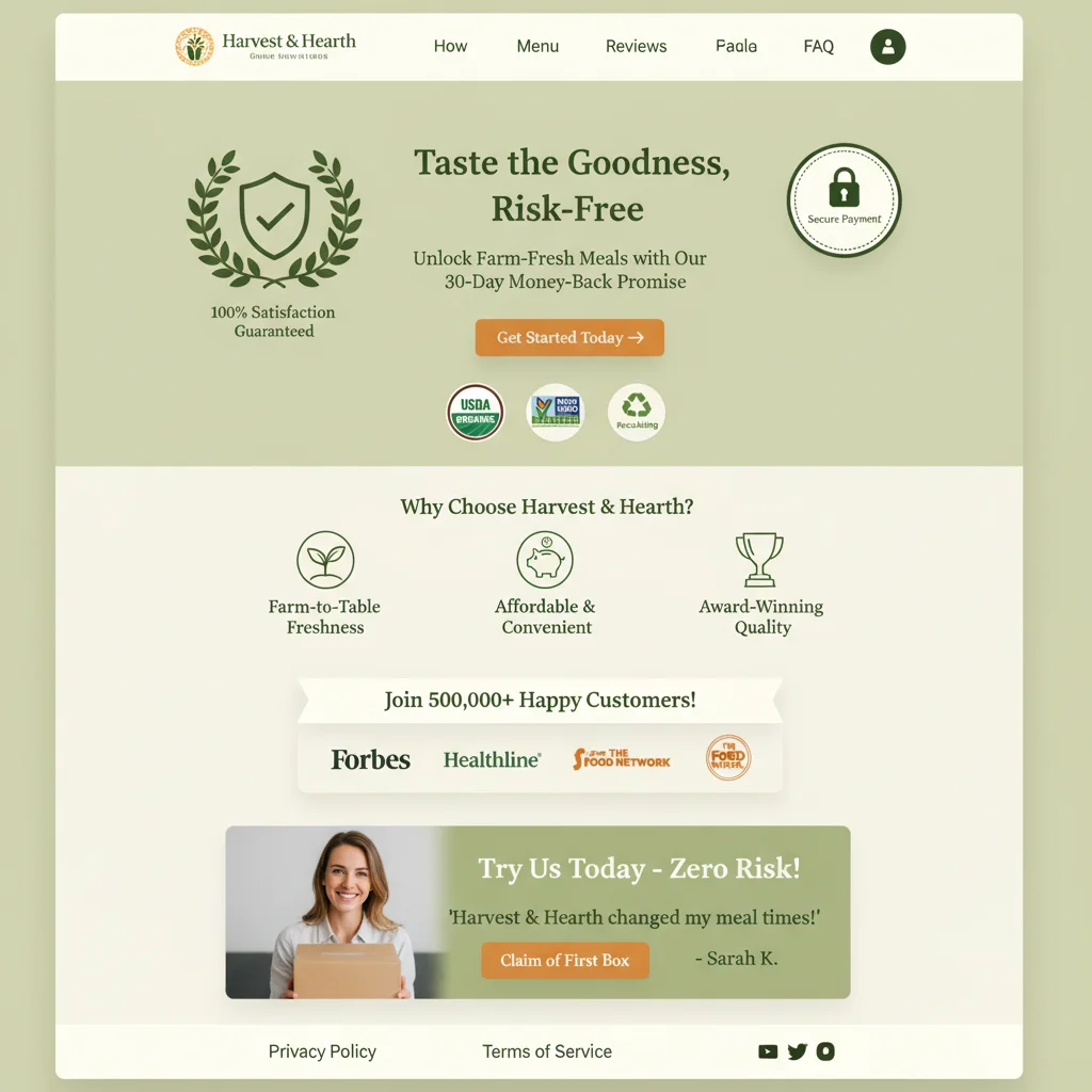
Online shoppers hesitate because they fear making the wrong choice. Your CTA should eliminate that fear by removing perceived risk. Free trials, money-back guarantees, and no-commitment offers work because they let prospects try before they buy.
Zoho’s “Sign up for free” approach works because there’s no financial commitment. Prospects can explore the software without risk. This strategy works particularly well for SaaS products and service-based businesses.
Consider what risks your prospects face and address them directly in your CTA copy. When designing your website’s user experience, always minimise friction and perceived risk.
Create Urgency That Drives Action
Scarcity drives decision-making. When prospects believe an offer is limited, they act faster. But your urgency must be genuine – fake countdown timers and false scarcity damage trust and hurt long-term conversions.
Springfree Trampoline’s limited-time financing offer creates legitimate urgency. The promotion has a real deadline, which motivates prospects to act now rather than later. This approach works because the scarcity is authentic.
Effective Urgency Tactics That Work
- Limited-time pricing (with real deadlines)
- Stock quantity indicators
- Seasonal promotions
- Early-bird discounts
- Flash sales with countdown timers
Remember, urgency should enhance your offer, not replace value. Your digital marketing strategy should balance urgency with genuine value propositions.
Test Multiple CTA Variations
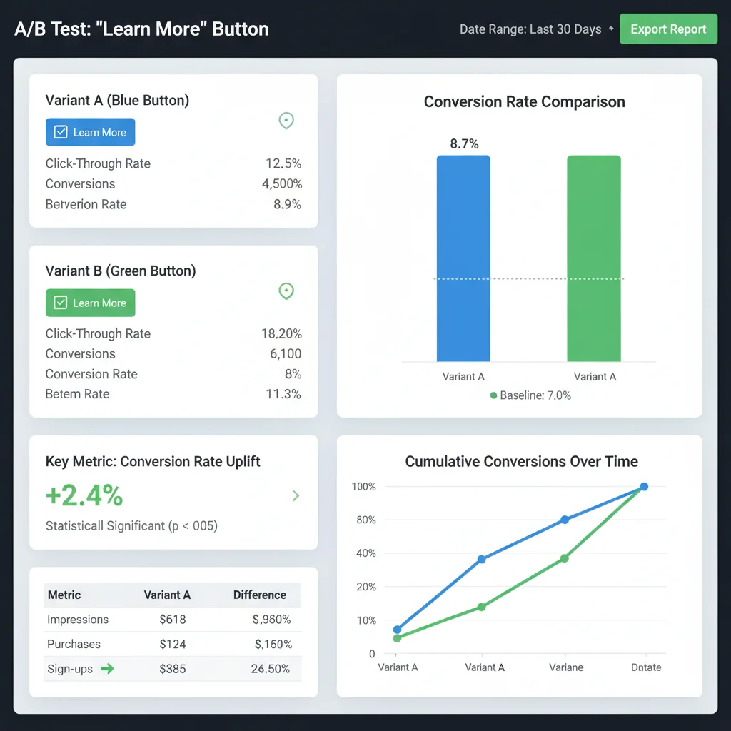
What works for Dropbox might not work for your business. The only way to find your highest-converting CTA is through systematic testing. Test different colours, copy, positioning, and sizes to find what resonates with your specific audience.
Elements to Test
- Button colour: Test contrasting colours against your brand palette
- Copy length: Compare short punchy text vs detailed benefit descriptions
- Button size: Larger buttons often convert better, but test your limits
- Position: Try multiple locations on long-form landing pages
- Urgency language: Test different scarcity approaches
Just like optimising your SEO performance metrics, CTA optimisation requires ongoing measurement and refinement.
Design CTAs for Mobile Users
Mobile traffic dominates most industries, yet many CTAs fail on smaller screens. Your buttons need to be large enough for thumb navigation, positioned for easy access, and loaded quickly on mobile connections.

Mobile CTA Best Practices
- Minimum 44px height for touch targets
- Sufficient spacing between clickable elements
- Fast-loading buttons that don’t require large images
- Thumb-friendly positioning in the natural scroll path
- Clear visual feedback when tapped
Mobile optimisation extends beyond CTAs to your entire website speed and user experience. Slow-loading pages kill conversions regardless of how compelling your CTA copy is.
Common CTA Mistakes That Kill Conversions
Even experienced marketers make CTA mistakes that sabotage their conversion rates. Avoid these common pitfalls that we see repeatedly in client audits:
Too Many Options
Multiple CTAs on a single page split visitor attention and reduce conversions. Focus on one primary action per page. If you need secondary options, make them visually subordinate to your main CTA.
Generic Copy
“Learn More” and “Get Started” don’t tell visitors what they’re getting. Be specific about the value and outcome. “Download Your Free SEO Audit” converts better than “Get Started” because it’s specific and valuable.
Poor Colour Contrast
Beautiful design means nothing if visitors can’t see your CTA. Test your colour combinations for accessibility and visual prominence. Your button should pass WCAG contrast guidelines while standing out from surrounding elements.

Measuring and Optimising CTA Performance
Track the right metrics to understand how your CTAs perform. Conversion rate is obvious, but dig deeper into user behaviour to identify improvement opportunities.
Key Metrics to Monitor
- Click-through rate: Percentage of visitors who click your CTA
- Conversion rate: Percentage who complete the desired action
- Bounce rate: Visitors who leave without engaging
- Heat map data: Where visitors focus attention on your page
- Device performance: How CTAs perform across different devices
Use Google Analytics, heat mapping tools, and A/B testing platforms to gather this data. Regular analysis helps you identify patterns and optimisation opportunities that aren’t obvious from surface-level metrics.
Remember, CTA optimisation is an ongoing process, not a one-time fix. A strong website design foundation makes every CTA more effective. Market conditions change, audiences evolve, and what worked last year might not work today. Stay committed to testing and refinement.
Ready to transform your landing page conversions? At PWD Digital, we help businesses create high-converting landing pages that turn traffic into customers. Our team combines conversion rate optimisation with strategic digital marketing to maximise your campaign ROI.
Frequently Asked Questions
What makes a call-to-action button effective?
Effective CTA buttons use contrasting colours, benefit-focused copy, and clear positioning above the fold. They should be large enough for mobile users and tell visitors exactly what they’ll get when they click.
How many CTA buttons should I have on a landing page?
Focus on one primary CTA per landing page to avoid splitting visitor attention. If you need secondary options, make them visually subordinate to your main call-to-action.
Should I use urgency in my CTA copy?
Yes, but only if it’s genuine. False urgency damages trust and hurts long-term conversions. Use real deadlines, limited stock quantities, or seasonal promotions to create authentic scarcity.
What CTA copy works better than ‘Click Here’?
Use benefit-focused copy that tells visitors what they’ll receive. Examples include ‘Download Your Free Guide’, ‘Start Your Free Trial’, or ‘Get Your Custom Quote’. Be specific about the value.
How do I test my CTA performance?
Use A/B testing to compare different button colours, copy, sizes, and positions. Track click-through rates, conversion rates, and use heat mapping tools to understand user behaviour on your landing pages.
What size should CTA buttons be for mobile users?
CTA buttons should be at least 44px in height for easy thumb navigation on mobile devices. Ensure sufficient spacing between clickable elements and position buttons within the natural scroll path.