Landing Page Testing: What to Test to Drive More Conversions in 2026

Your gut tells you the landing page needs work. Conversions are flat, visitors bounce too quickly, and that shiny new design isn’t delivering the results you expected. But here’s the thing about gut feelings and landing page optimisation – they don’t mix well.
Landing pages are the workhorses of your digital marketing strategy. These focused pages exist for one purpose: converting visitors into customers, leads, or subscribers. Whether you’re driving traffic from Google Ads, social media, or email campaigns, your landing page performance directly impacts your bottom line.
This is where A/B testing becomes essential. Split testing lets you compare two versions of a landing page – your control against a variation with specific changes. The version that converts better wins, and you iterate from there. No guesswork, just data-driven decisions that improve your conversion rates.
Why Your Landing Page Needs Systematic Testing
Random changes to your landing pages waste time and money. Every element on your page affects user behaviour differently, and small tweaks can produce massive results. We’ve seen single headline changes boost conversions by 90%, colour adjustments increase click-through rates by 35%, and image swaps deliver 161% more leads.
The key is testing strategically. Focus on high-impact elements that directly influence your visitor’s decision to convert. Here are the four landing page elements that deliver the biggest conversion improvements when optimised properly.
1. Headlines That Hook and Convert
David Ogilvy nailed it: “On the average, five times as many people read the headline as read the body copy.” Your headline is often the only copy visitors will read, making it the most important conversion element on your page.
Users scan web pages rather than reading every word. Your headline needs to grab attention immediately and communicate clear value. Test these three headline approaches to find what resonates with your audience.
Lead with Specific Benefits
Generic headlines like “The Best Solution for Your Business” tell visitors nothing. Benefit-focused headlines explain exactly what users get from your offer. Dropbox masters this with headlines like “Keep your files safe, synced, and easy to share” – clear, specific, and immediately valuable.
Your headline should answer the visitor’s immediate question: “What’s in this for me?” Test variations that lead with the primary benefit your product or service delivers.
Use Specific Numbers and Data
“Trusted by thousands” sounds impressive until you see “Used by over 100,000 businesses.” Specific numbers create credibility and social proof simultaneously. Shopify excels at this approach, using headlines like “Powering over 1.7 million businesses in 175 countries.”
Test headlines that include specific metrics relevant to your audience – customer counts, time savings, cost reductions, or percentage improvements.
Be Direct and Clear
Sometimes the simplest approach wins. A VWO case study tested multiple headline variations, and the most straightforward, descriptive headline delivered a 90% conversion increase over clever but vague alternatives.
Don’t sacrifice clarity for creativity. Test headlines that plainly describe what you offer and who benefits from it.
2. Call-to-Action Buttons That Demand Clicks
Your call-to-action (CTA) button is where conversions happen. Every visitor who converts must click this button, making it a high-impact testing priority. Small changes to CTA design and copy can dramatically affect your conversion rates.
Colour and Visual Design
Your CTA must stand out from your website design using contrasting colours. But the right colour depends on your overall design palette. One case study saw a 35.81% conversion increase simply by changing button colour and shape – proving that visual elements significantly impact user behaviour.
Test different button colours, sizes, and shapes. Ensure your CTA creates visual hierarchy and draws attention without clashing with your brand colours.
Strategic Button Placement
The Nielsen Norman Group found that 80% of viewing time happens above the fold, suggesting CTAs should appear prominently at the top of pages. However, one study achieved better conversions by moving the CTA below the fold, after providing more context about the offer.
Test multiple CTA placements. Consider your offer complexity – simple offers might convert better with immediate CTAs, while complex products may need explanation before asking for action.
Action-Oriented Copy
Generic CTAs like “Click Here” or “Submit” waste conversion potential. Specific, benefit-focused button copy outperforms vague alternatives consistently. Instead of “Learn More,” try “Get Your Free Quote” or “Download the Guide.”
Test CTA copy that describes the specific action and value. Use action verbs and address visitor motivations directly.
3. Images That Connect and Convert
MIT neuroscientists discovered that human brains process images in just 13 milliseconds – faster than any text on your page. The right images engage visitors immediately, while poor image choices cause quick exits.
Eye tracking studies reveal that users ignore generic stock photos, especially obviously staged ones. Your images need to feel authentic and relevant to your specific offer.
Real People Over Stock Photos
One powerful case study compared a generic stock photo of a truck driver against an image of an actual student from a driving academy. The authentic student photo produced a 161% increase in conversions – a massive improvement from a single image change.
The authentic image worked because it directly related to the service offered – truck driving lessons. Visitors could visualise themselves as successful graduates, making the offer more tangible and achievable.
Product-Focused Visuals
When possible, show your actual product or service in action. Square does this effectively by showcasing their payment terminals in real business environments, helping potential customers understand exactly what they’re buying.
Test images that demonstrate your product’s value proposition visually. Show the end result or transformation your service provides.
4. Social Proof That Builds Trust
Social proof taps into fundamental human psychology – we look to others’ behaviour to guide our own decisions. McDonald’s famously used “Over 1 billion served” to demonstrate widespread acceptance and quality.
The same principle works powerfully on landing pages. Different types of social proof appeal to different audiences, so test multiple approaches to find what builds trust with your specific market.
Customer Testimonials
Testimonials from real customers carry significant weight. They provide specific benefits and outcomes that potential customers can relate to. Basecamp showcases customer testimonials prominently, focusing on concrete results rather than generic praise.
Test testimonials that include specific outcomes, company names, and photos when possible. Generic praise like “Great service!” carries less weight than detailed success stories.
Client Logos and Badges
Displaying recognised client logos instantly builds credibility. Dropbox showcases major companies using their business platform, demonstrating enterprise-level trust and capability.
Test different arrangements and selections of client logos. Feature the most recognisable names prominently, and ensure logos are current and high-quality.
Specific Numbers and Metrics
Quantified social proof often outperforms general statements. Social Media Examiner uses specific subscriber counts to encourage newsletter signups, making their audience size tangible and appealing.
Test different metrics that demonstrate your reach or success – customer counts, years in business, projects completed, or money saved for clients.
Testing Strategy and Implementation
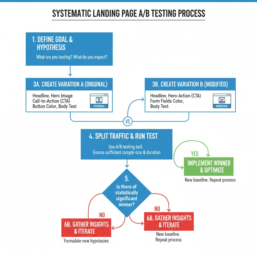
Effective landing page testing requires systematic approach. Test one element at a time to isolate what drives improvements. Run tests for sufficient duration to achieve statistical significance – typically 2-4 weeks depending on your traffic volume.
Focus on high-traffic landing pages first. Pages with more visitors generate faster, more reliable test results. Document all changes and results to build a knowledge base of what works for your specific audience and industry.
Remember that website usability principles still apply. Don’t sacrifice user experience for conversion tactics. The best-converting landing pages provide genuine value while making it easy for visitors to take action.
Measuring and Analysing Results
Conversion rate is your primary metric, but don’t ignore secondary indicators. Monitor bounce rate, time on page, and scroll depth to understand user engagement. Sometimes a variation increases conversions but reduces lead quality – track the full customer journey.
Use tools like Google Analytics 4 and Google Optimize to set up and monitor tests. Heat mapping tools like Hotjar reveal how users interact with different page elements, providing insights beyond conversion numbers.
Consider mobile performance separately. Mobile users behave differently from desktop visitors, and elements that work well on desktop may fail on mobile devices. Always test responsive design variations.
Frequently Asked Questions
How long should I run A/B tests on landing pages?
Run tests for at least 2-4 weeks or until you reach statistical significance. You need sufficient traffic and conversions to ensure reliable results. Ending tests too early leads to false conclusions.
What’s the most important element to test first on a landing page?
Start with your headline – it’s the first thing visitors see and has the biggest impact on whether they stay or leave. A compelling headline can improve conversions by 20-90% based on industry studies.
How many variations should I test at once?
Test one element at a time to isolate what drives improvements. Testing multiple changes simultaneously makes it impossible to know which change affected your results.
Can I use the same winning elements across all my landing pages?
Not necessarily. Different audiences and offers may respond differently to the same elements. Test winning elements on other pages, but don’t assume they’ll work universally.
What conversion rate should I expect from landing page testing?
Improvement varies widely by industry and current performance. Well-executed tests typically improve conversions by 10-30%, though dramatic improvements of 50%+ are possible with significant changes.
Do I need special software for landing page A/B testing?
Google Optimize provides free A/B testing capabilities, while paid tools like Optimizely and VWO offer more advanced features. Choose based on your traffic volume and testing complexity needs.