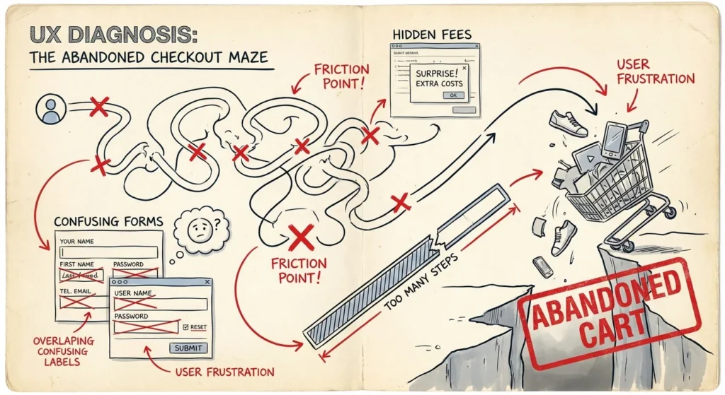
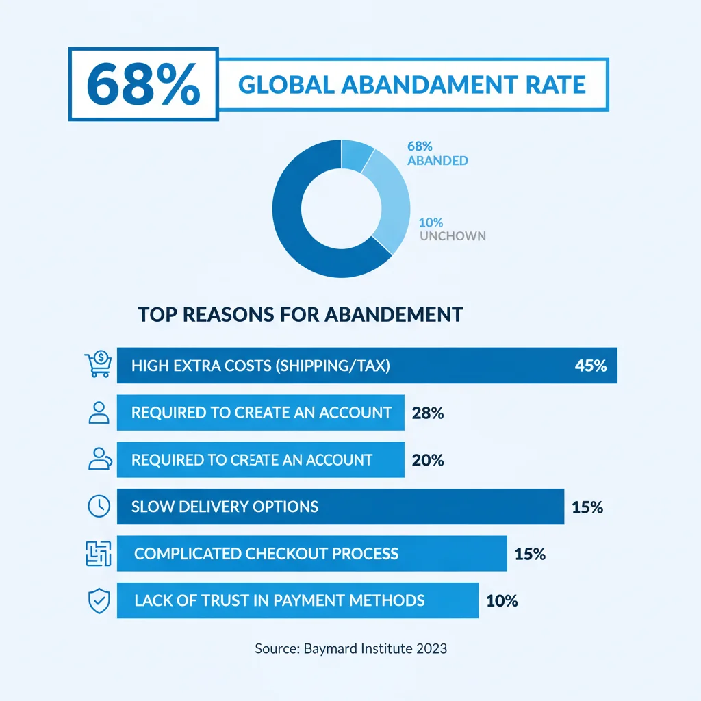
68% of potential customers fill their shopping cart with products, then walk away without buying. If you’re running Google Ads and driving traffic to your eCommerce site, this statistic should keep you awake at night. You’ve paid for that click, attracted their interest, and convinced them to add products to their cart – yet they’re still abandoning their purchase at the last moment.
The problem often isn’t your ads or your products. Your checkout system is silently destroying your conversion rates, turning qualified leads into expensive missed opportunities. We see this constantly with our eCommerce clients – brilliant marketing campaigns undermined by friction-filled checkout processes.
After 15+ years optimising eCommerce sites, we’ve identified the four critical areas that make or break checkout conversions. Fix these, and you’ll transform those abandoned carts into completed sales.
For more detail, see our guide on eCommerce design tips that boost sales.
Why Checkout Systems Kill Conversions
Research from Kissmetrics reveals that most shoppers don’t even make it past the first checkout stage. The data is sobering – customers who’ve already shown purchase intent are bailing out en masse.
The numbers tell the story clearly. Checkout systems directly cause at least 12% of lost conversions, but the real figure is much higher when you factor in related issues like unexpected costs, forced account creation, and poor mobile experiences.
Even Business Insider recognises checkout friction as a major conversion killer. The research is consistent across industries – complicated checkout processes directly translate to lost revenue.
We’ve identified four areas where checkout systems typically fail customers. Address these systematically, and you’ll see immediate improvements in your conversion rates and marketing ROI.
Stop Wasting Your Customers’ Time
Modern shoppers are impatient. They want to buy quickly and efficiently. Every unnecessary step, slow-loading page, or confusing interface increases the chance they’ll abandon their purchase.
Minimise Required Fields
Strip your checkout down to absolute essentials. Every additional field decreases conversion rates. Ask only for information you need to process the order and fulfill the delivery. Marketing surveys and preference questions can wait until after the sale.
Email address, billing information, and shipping details (if physical products) – that’s your bare minimum. Everything else is optional at best, conversion-killing at worst.
Use Progress Indicators
Progress bars are checkout psychology gold. They tell customers exactly where they are in the process and how much remains. This simple visual cue reduces abandonment significantly by managing expectations.
Use clear labels like “Shipping”, “Payment”, “Review” rather than generic “Step 1, 2, 3”. Customers should know what’s coming next.
Optimise Loading Speed
44% of customers abandon purchases when pages load slowly. This problem compounds on mobile devices, where 85% of users expect checkout pages to load as fast or faster than desktop versions.
Test your checkout speed using Google PageSpeed Insights. Remove unnecessary social media widgets, third-party scripts, and heavy graphics from checkout pages. These elements add visual appeal but kill conversions when they slow down the purchase process.
Regular stress testing is essential. Your checkout needs to perform under traffic spikes from successful advertising campaigns.
Never Force Account Creation
This is non-negotiable. Forced account creation kills 23% of conversions instantly. People are tired of managing countless passwords and accounts. They want to buy your product, not join your database.
Always offer guest checkout. You can encourage account creation after purchase with incentives like order tracking or exclusive offers, but never make it mandatory for buying.
Avoid Captcha Forms
Captcha forms can reduce conversions by 3.2%. While preventing spam seems important, losing real customers is far worse for your bottom line. Modern security tools can handle spam protection without frustrating genuine buyers.
Limit Promotional Clutter
Free samples, discount codes, and bonus offers can boost conversions – if used sparingly. Too many choices overwhelm customers and slow down the purchase process.
Urban Decay exemplifies this problem – customers must navigate through multiple sample selections, coupon codes, and signup offers before completing their purchase. Sometimes customers just want to buy and go.
Provide Live Support
Even perfect checkout systems occasionally confuse customers or encounter technical glitches. Live chat and click-to-call buttons can salvage these situations and convert hesitant buyers.
Include call tracking in your conversion measurement to capture these phone-based sales in your campaign data.
Manage Delivery Expectations
Long delivery times kill gift purchases and impulse buys. Offer expedited shipping options, even if they cost extra. Many customers will pay for faster delivery, especially for time-sensitive purchases.
Use progress tracking and email updates to maintain customer engagement after purchase. Amazon sets the standard here with their delivery tracking system.
Build Customer Trust
Online customers can’t touch or examine products before buying. They’re placing significant trust in your business. Any element that undermines this trust will send them looking for alternatives.
Display Security Badges
Security badges from recognised authorities reduce customer anxiety significantly. Position them prominently near payment fields where security concerns are highest.
Maintain Consistent Branding
Third-party payment systems often break your site’s visual consistency. This jarring change makes customers question whether they’re still on your site or being redirected to a potentially fraudulent page.
Invest in branded payment solutions that maintain your site’s design consistency. If you must use third-party systems, choose providers that offer customisation options.
Feature Customer Reviews
55% of shoppers say online reviews influence their purchasing decisions. Strategic review placement during checkout can overcome last-minute hesitation.
Explain Data Collection
Customers are suspicious of phone number requests because they expect sales calls. When mobile numbers are required, clearly state they’re for delivery updates only, not marketing.
Offer Multiple Payment Options
Accept major credit cards (Visa, Mastercard, American Express) alongside digital wallets like PayPal, Apple Pay, and Google Pay. Different customers prefer different payment methods – don’t force them to adapt to your limitations.
If accepting card details directly, ensure PCI compliance. For guidance on payment gateway selection, this resource covers the key considerations.
Keep Customers on Your Domain
Redirecting customers to external payment sites raises scam suspicions and breaks your conversion tracking. Keep the entire transaction on your domain whenever possible.
Ensure Name Consistency
Your trading name must match the business name on payment confirmations. Mismatched names trigger fraud alerts in customers’ minds. If using a trading name, clearly state its relationship to your registered business name.
Publish Returns Policies
Clear returns policies reduce purchase anxiety. Customers need to know they can return damaged items or get refunds for unsatisfactory digital products. While processing returns costs money, the conversion rate boost from offering them typically more than compensates.
Remove Financial Friction
Money remains the biggest conversion barrier. Hidden costs and poor value perception kill more sales than any other factor.
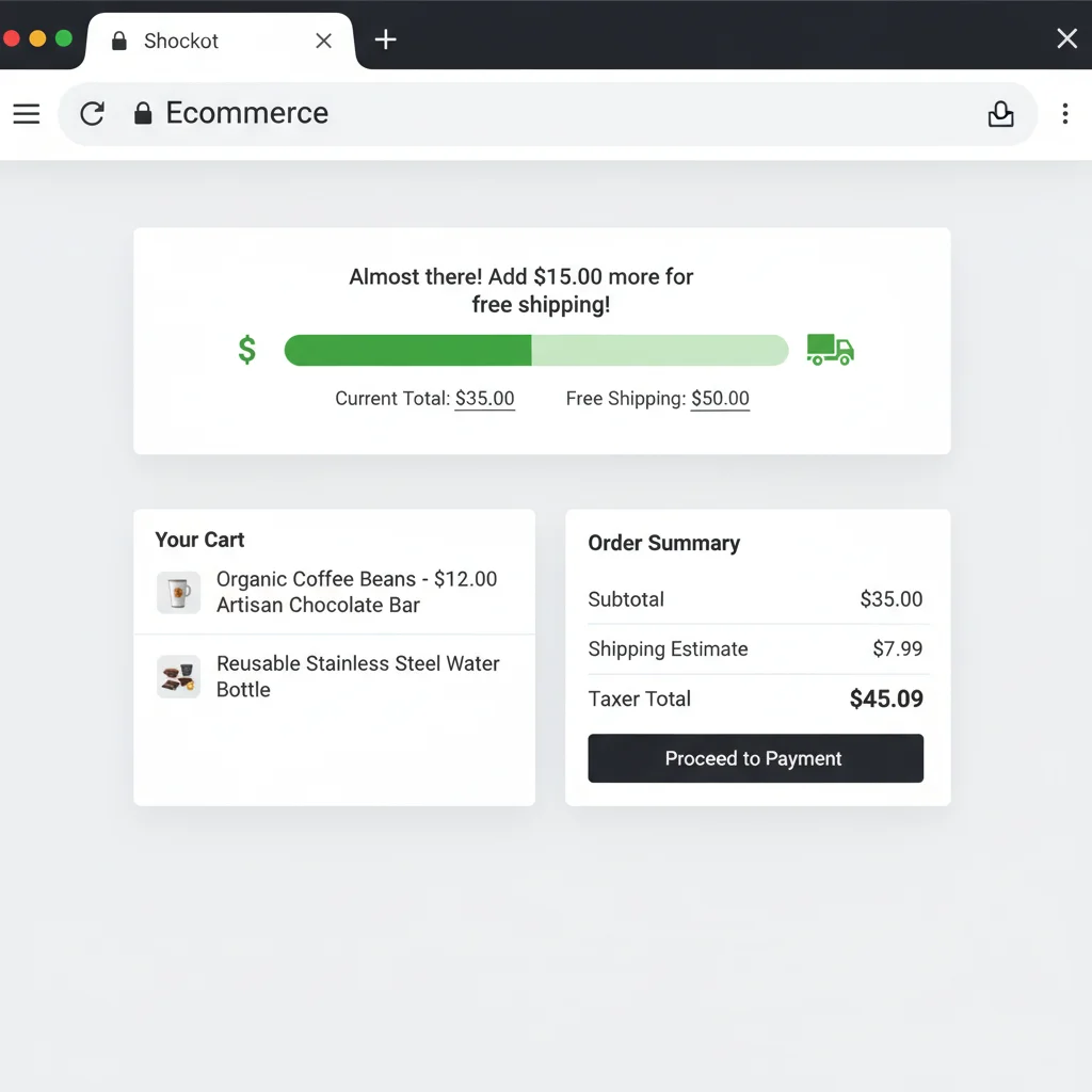
Show Complete Costs Upfront
61% of shoppers abandon carts because additional costs are too high, while another 24% leave because they couldn’t see total costs upfront. Hiding shipping, taxes, or fees until checkout feels deceptive and destroys trust.
Display all costs clearly on product pages and throughout the shopping experience. Transparency builds trust and reduces abandonment.
Display Running Totals
Show cart totals prominently as customers add items. This helps budget-conscious shoppers manage their spending and prevents checkout shock when they see the final total.
Consider customers who add multiple reasonably-priced items without tracking the cumulative cost. A running total helps them make informed decisions before reaching checkout, increasing the likelihood they’ll complete their purchase rather than abandoning a surprisingly expensive cart.
Offer Free Shipping
Free shipping remains one of the most effective conversion boosters. If you can’t offer completely free shipping, consider free shipping thresholds to encourage larger orders.
Optimise for Mobile Users
Mobile accounts for 50.3% of eCommerce traffic, yet mobile conversion rates consistently lag behind desktop. The problem isn’t mobile users – it’s checkout systems designed only for desktop computers.
Understanding mobile user behaviour is essential for optimising mobile checkouts. Research shows most people hold their phones one-handed, relying on thumb navigation.
Only 15% of users browse two-handed, so design for single-thumb operation. Understanding thumb reach zones is essential for button placement.
Place critical buttons and CTAs in the easy-reach zone. Avoid positioning important elements in screen corners where thumbs struggle to reach comfortably.
Design Larger Touch Targets
Make form fields and buttons significantly larger for mobile. Thumbs are less precise than mouse cursors, and small touch targets frustrate users and cause input errors.
Use full-width buttons for primary actions like “Proceed to Checkout” and “Complete Purchase”. This eliminates the precision required for small buttons and reduces accidental mis-taps.
Stack Form Elements
Place each form field, button, and action on separate rows with generous spacing. Side-by-side elements that work well on desktop become cramped and error-prone on mobile screens.
Use Multi-Page Checkout
While desktop users can handle longer forms, mobile users need simplified, paginated checkout flows. Divide the process into logical sections: shipping information, payment details, and order review.
Amazon demonstrates excellent mobile checkout design with clear progression and minimal scrolling required on each screen.

Compare this to Etsy’s checkout, which requires scrolling through multiple long pages with smaller buttons. Amazon’s approach clearly wins for mobile usability.
Optimise Keyboard Types
Trigger numeric keypads for phone and credit card number fields. The standard alphanumeric keyboard has small number keys that are difficult to use accurately. The dedicated numeric keypad offers larger, easier-to-tap number buttons.
This simple HTML attribute change significantly improves the mobile checkout experience. The Baymard Institute offers detailed implementation guidance for various field types.
Advanced Conversion Optimisation Strategies
Beyond solving basic checkout problems, implementing these advanced strategies will give you a competitive edge and maximise conversion rates.
Use Visual Hierarchy
Design buttons with clear priority signals. Use prominent colours for primary actions like “Proceed to Checkout” and subtle colours for secondary actions like “Continue Shopping”. This visual hierarchy guides customers toward conversion.
Implement Persistent Carts
Most shopping carts expire too quickly, losing customers who need time to consider purchases or wait for payday. Maintain cart contents for up to 30 days, giving customers multiple opportunities to complete their purchase.
Consider wishlist functionality for customers researching future purchases. This captures their interest even when they’re not ready to buy immediately.
Create Purchase Urgency
Low stock indicators and limited-time offers encourage immediate action. Display messages like “Only 3 left in stock” or “Sale ends in 2 hours” to create urgency without being deceptive.
Hotels.com effectively uses this psychology with messages about room availability and booking pressure from other customers.
Deploy Retargeting Campaigns
Not every visitor will convert on their first visit. Retargeting through display ads, search campaigns, and email sequences gives you multiple chances to complete the sale.
Email retargeting combined with persistent carts recovers 3-11% of abandoned sales monthly. Radley London recovered 7.9% of lost sales using cart abandonment emails – a significant revenue recovery for minimal investment.
Your retargeting strategy should include multiple touchpoints: immediate abandonment emails, reminder emails after 24 hours, and final discount offers after a week.
Adopt New Technologies
Early adoption of conversion-improving technologies gives you competitive advantages. Credit card scanning, one-click payments, and biometric authentication all reduce checkout friction.
Stay updated on emerging payment methods and authentication technologies. Being first in your industry to offer streamlined payment experiences positions you as an innovation leader.
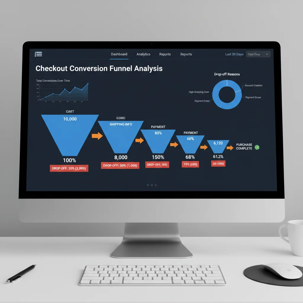
Testing and Continuous Improvement
Checkout optimisation requires ongoing testing and refinement. Customer expectations evolve, new technologies emerge, and your business grows. What works today may not work tomorrow.
Test your checkout process regularly from the customer perspective. Complete purchases on mobile and desktop. Time the process. Note frustration points. Your firsthand experience often reveals issues that analytics miss.
Monitor key metrics: cart abandonment rates, conversion rates by device, checkout completion times, and customer support requests related to checkout issues. These metrics highlight improvement opportunities and measure the impact of changes.
A/B test significant changes before full implementation. Button colours, form layouts, progress indicators, and payment options all impact conversions differently for different audiences.
Google Analytics provides a helpful video demonstrating what poor checkout experiences feel like in the real world. This comparison between online and offline shopping experiences highlights why customers abandon carts.
The Business Impact
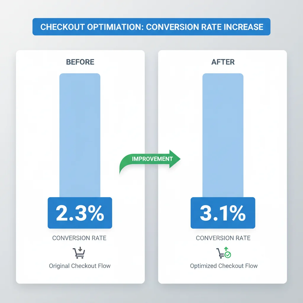
Optimising your checkout system delivers immediate and measurable results. Clients typically see 15-30% increases in conversion rates after implementing these improvements. For a business processing $100,000 monthly through eCommerce, a 20% conversion rate increase adds $20,000 monthly revenue – $240,000 annually.
The investment in checkout optimisation pays for itself quickly. Most improvements require design and development work rather than ongoing costs, making the ROI exceptional.
Better checkout experiences also improve customer satisfaction and repeat purchase rates. Customers who have smooth initial purchases are more likely to buy again and recommend your business to others.
From an advertising perspective, higher conversion rates improve your cost per acquisition and return on ad spend. The same Google Ads budget that generated 100 sales now generates 120-130 sales, dramatically improving campaign profitability.
Implementation Priorities
Start with the highest-impact, lowest-effort improvements. Here’s your priority sequence:
- Enable guest checkout – This single change can boost conversions by 20%+
- Display all costs upfront – Eliminate checkout surprises that cause abandonment
- Optimise mobile experience – Focus on larger buttons, stacked layout, and numeric keypads
- Add progress indicators – Help customers understand the checkout process
- Improve page speed – Target under 3-second load times for all checkout pages
- Implement cart abandonment email sequences – Recover lost sales automatically
Each improvement builds on the previous ones, creating compound effects on conversion rates. Don’t try to implement everything simultaneously – staged improvements allow you to measure the impact of each change.
Working with experienced digital marketing professionals accelerates implementation and ensures best practices. We’ve optimised hundreds of checkout systems and understand the technical requirements, design considerations, and testing methodologies that deliver results.
Your checkout system should be your conversion engine, not your conversion killer. Every abandoned cart represents lost revenue and wasted advertising spend. The solutions exist, the technology is available, and the ROI is proven. The only question is when you’ll start optimising your checkout system to capture the revenue you’re currently losing.
What is the average shopping cart abandonment rate?
The average shopping cart abandonment rate is 68.63%. This means more than two-thirds of customers who add items to their cart leave without completing the purchase, representing significant lost revenue for eCommerce businesses.
Should I force customers to create accounts during checkout?
Never force account creation during checkout. This practice kills 23% of conversions instantly. Always offer guest checkout options and encourage account creation after purchase with incentives like order tracking or exclusive offers.
How does mobile checkout performance compare to desktop?
Mobile accounts for 50.3% of eCommerce traffic but typically has lower conversion rates than desktop. This gap is primarily due to checkout systems designed only for desktop computers rather than optimised for mobile users’ behaviour and device limitations.
What are the main reasons customers abandon shopping carts?
The top reasons for cart abandonment include unexpected additional costs (61%), inability to see total costs upfront (24%), forced account creation (23%), slow loading pages (44%), and poor mobile experience. Checkout system issues directly cause at least 12% of abandonments.
How much can checkout optimisation improve conversion rates?
Properly optimised checkout systems typically see 15-30% increases in conversion rates. For a business processing $100,000 monthly, a 20% improvement adds $20,000 monthly revenue, or $240,000 annually.
What’s the most important checkout optimisation to implement first?
Enable guest checkout first – this single change can boost conversions by 20% or more. Then focus on displaying all costs upfront, optimising mobile experience, and adding progress indicators before moving to more advanced optimisations.
Frequently Asked Questions
What is the average shopping cart abandonment rate?
The average shopping cart abandonment rate is 68.63%. This means more than two-thirds of customers who add items to their cart leave without completing the purchase, representing significant lost revenue for eCommerce businesses.
Should I force customers to create accounts during checkout?
Never force account creation during checkout. This practice kills 23% of conversions instantly. Always offer guest checkout options and encourage account creation after purchase with incentives like order tracking or exclusive offers.
How does mobile checkout performance compare to desktop?
Mobile accounts for 50.3% of eCommerce traffic but typically has lower conversion rates than desktop. This gap is primarily due to checkout systems designed only for desktop computers rather than optimised for mobile users’ behaviour and device limitations.
What are the main reasons customers abandon shopping carts?
The top reasons for cart abandonment include unexpected additional costs (61%), inability to see total costs upfront (24%), forced account creation (23%), slow loading pages (44%), and poor mobile experience. Checkout system issues directly cause at least 12% of abandonments.
How much can checkout optimisation improve conversion rates?
Properly optimised checkout systems typically see 15-30% increases in conversion rates. For a business processing $100,000 monthly, a 20% improvement adds $20,000 monthly revenue, or $240,000 annually.
What’s the most important checkout optimisation to implement first?
Enable guest checkout first – this single change can boost conversions by 20% or more. Then focus on displaying all costs upfront, optimising mobile experience, and adding progress indicators before moving to more advanced optimisations.