
Your website’s background colour makes or breaks the user experience. While there are hundreds of design decisions that impact how visitors interact with your site, background colour often gets overlooked despite being one of the most critical elements.
Take a moment to think about your favourite websites. Google, Facebook, Amazon, Wikipedia – they all use white backgrounds with dark text. This isn’t coincidence. There are solid, research-backed reasons why web usability experts consistently recommend white backgrounds for optimal user experience.
Why White Backgrounds Dominate the Web
The dominance of white backgrounds across successful websites isn’t arbitrary. It stems from fundamental principles of human psychology, readability science, and accessibility standards. Here’s why white backgrounds consistently outperform coloured alternatives.
Superior Readability and Comprehension
We’ve been reading black text on white surfaces for centuries. Books, newspapers, letters, and documents all use this colour combination for a simple reason – it works. Our brains are hardwired to process this contrast efficiently.
Research shows that black text on white backgrounds increases reading speed by up to 32% compared to white text on dark backgrounds. This translates directly to better user engagement and lower bounce rates on your website.
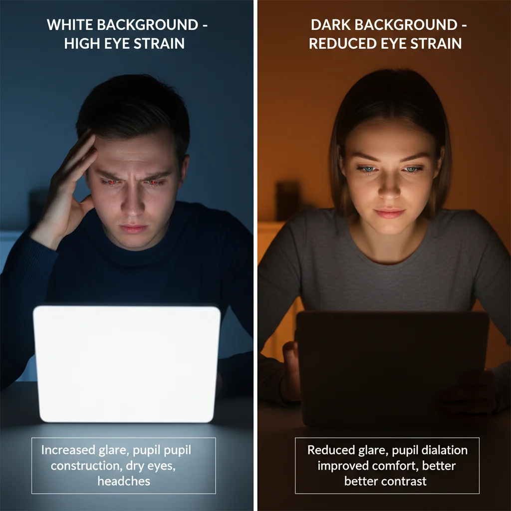
Reduced Eye Strain and Fatigue
Dark backgrounds with bright text force your eyes to work harder. The pupils dilate to let in more light, causing muscle fatigue and strain. This is particularly problematic for users who spend extended time reading content on your site.
White backgrounds reflect more light naturally, requiring less effort from the eye muscles. Your visitors can read longer, engage more deeply with your content, and are more likely to complete desired actions like filling out forms or making purchases.
Better Accessibility for All Users
Accessibility isn’t just about compliance – it’s about reaching your entire audience effectively. White backgrounds significantly improve readability for users with visual impairments, older adults, and anyone using devices in various lighting conditions.
The Web Content Accessibility Guidelines (WCAG) recommend a minimum contrast ratio of 4.5:1 for normal text. Black text on white backgrounds achieves a contrast ratio of 21:1 – far exceeding accessibility standards and ensuring your content reaches everyone.
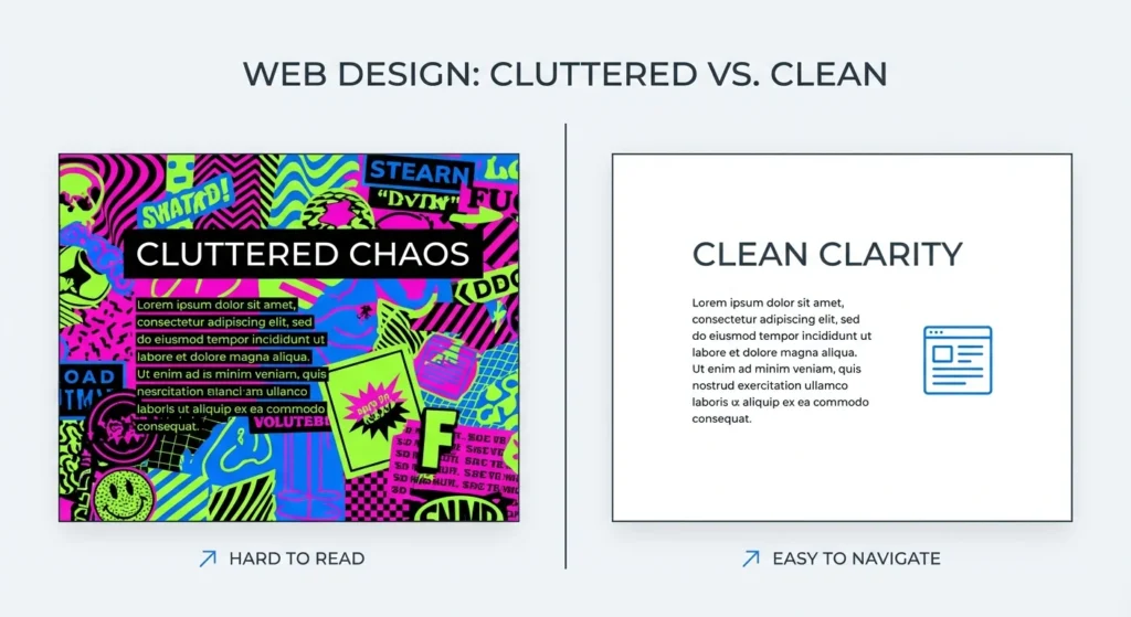
Clean, Professional Appearance
White backgrounds create a sense of cleanliness and professionalism that builds trust with visitors. They provide a neutral canvas that lets your content and branding elements shine without distraction.
Coloured backgrounds often clash with images, create visual noise, and can make text hard to read. White eliminates these issues while maintaining a timeless, professional look that won’t appear outdated in a few years.

The Science Behind Colour Psychology
Colour psychology plays a significant role in how users perceive and interact with your website. White backgrounds tap into psychological associations that benefit your business goals.
Trust and Credibility
White is associated with cleanliness, simplicity, and trustworthiness. These associations transfer to your brand when users visit your site. Financial institutions, healthcare providers, and professional services companies particularly benefit from this psychological impact.
Studies show that websites with white backgrounds are perceived as more trustworthy and professional, leading to higher conversion rates and better user engagement metrics.
Cognitive Load Reduction
Every design element on your website requires mental processing power from visitors. Coloured backgrounds add unnecessary cognitive load, forcing users to work harder to focus on your content.
White backgrounds eliminate this distraction, allowing users to concentrate on what matters most – your message, products, or services. This reduced cognitive load leads to better comprehension and higher conversion rates.
Impact on User Experience and Conversions
The colour of your background directly affects key performance indicators that matter to your business. Here’s how white backgrounds drive better results.

Lower Bounce Rates
Users stay longer on websites that are easy to read and navigate. White backgrounds reduce the effort required to consume your content, naturally leading to longer session durations and lower bounce rates.
Our experience at PWD Digital Agency shows that clients who switch from dark or coloured backgrounds to white typically see bounce rate improvements of 15-25%.
Higher Conversion Rates
Readability directly impacts conversions. If users can’t easily read your value proposition, product descriptions, or call-to-action buttons, they won’t convert.
White backgrounds ensure maximum contrast and readability for all text elements, making it easier for users to understand your offer and take action. This is particularly important for optimising user experience across different devices and screen sizes.
Mobile Responsiveness Benefits
Mobile devices present unique challenges for readability. Smaller screens, varying lighting conditions, and touch interfaces all impact how users interact with your content.
White backgrounds perform consistently well across all mobile devices and lighting conditions. They also consume less battery power on OLED screens when displaying white content, improving the overall user experience.
SEO and Background Colour Connection
While Google doesn’t directly rank websites based on background colour, there’s an indirect but significant impact on your SEO performance.
User Experience Signals
Google’s algorithm considers user experience signals like bounce rate, time on page, and click-through rates. White backgrounds improve all these metrics by making your content more accessible and readable.
Better user experience signals lead to improved search rankings over time. If you’re experiencing ranking issues, it might be worth exploring common SEO mistakes that could be affecting your performance.
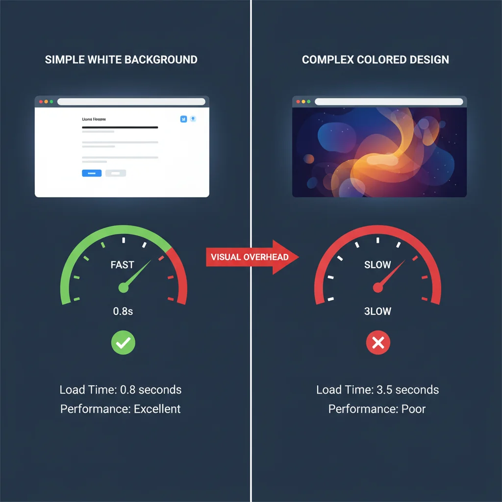
Page Speed Considerations
Complex background designs, gradients, or large background images can slow down page loading times. White backgrounds typically require minimal CSS and no additional image files, contributing to faster page speeds.
Page speed is a confirmed Google ranking factor, making white backgrounds an indirect SEO benefit. Combined with other website speed optimisation techniques, this can significantly improve your search performance.
When Dark Backgrounds Might Work
While we strongly advocate for white backgrounds, there are specific scenarios where darker alternatives might be appropriate. Understanding these exceptions helps you make informed design decisions.
Creative and Entertainment Industries
Photography portfolios, art galleries, and entertainment websites sometimes benefit from dark backgrounds that make visual content pop. However, even in these cases, ensure sufficient contrast for all text elements.
Gaming and Technology
Gaming websites and certain technology platforms use dark themes to align with user expectations and brand identity. The key is maintaining excellent contrast ratios and ensuring accessibility standards are met.
If you decide to use dark backgrounds, work with experienced web design professionals to ensure optimal implementation.
Implementation Best Practices
Switching to a white background isn’t just about changing your CSS background colour. Here’s how to implement white backgrounds effectively.
Gradual Transition Strategy
If your current site uses coloured backgrounds, implement changes gradually. Start with key pages like your homepage and primary landing pages, then expand to other sections based on performance data.
Monitor analytics closely during the transition to measure improvements in user engagement and conversion rates. This data will help you make informed decisions about expanding the changes site-wide.
Maintaining Brand Identity
White backgrounds don’t mean boring design. Use your brand colours strategically in headers, buttons, accent elements, and images while keeping the main content area white for optimal readability.
This approach maintains your brand identity while maximising usability and conversion potential. Consider consulting with a professional digital agency to ensure the transition aligns with your broader marketing strategy.
Does background colour affect website SEO rankings?
Background colour doesn’t directly impact SEO rankings, but it affects user experience metrics like bounce rate and time on page, which are indirect ranking factors.
Are white backgrounds better for mobile websites?
Yes, white backgrounds perform better on mobile devices due to improved readability in various lighting conditions and reduced battery consumption on OLED screens.
Can coloured backgrounds ever work for business websites?
While white backgrounds are generally superior, some creative industries and gaming sites can use dark backgrounds successfully if they maintain proper contrast ratios and accessibility standards.
How do white backgrounds improve conversion rates?
White backgrounds increase readability and reduce cognitive load, making it easier for users to understand your content and take desired actions like purchases or form submissions.
Do white backgrounds work for all age groups?
Yes, especially for older users who may have vision challenges. White backgrounds with dark text provide maximum contrast and reduce eye strain for all age demographics.
How quickly can I expect results after switching to white backgrounds?
Most websites see improvements in bounce rate and user engagement within 2-4 weeks of implementing white backgrounds, with conversion rate improvements following shortly after.
Frequently Asked Questions
Does background colour affect website SEO rankings?
Background colour doesn’t directly impact SEO rankings, but it affects user experience metrics like bounce rate and time on page, which are indirect ranking factors.
Are white backgrounds better for mobile websites?
Yes, white backgrounds perform better on mobile devices due to improved readability in various lighting conditions and reduced battery consumption on OLED screens.
Can coloured backgrounds ever work for business websites?
While white backgrounds are generally superior, some creative industries and gaming sites can use dark backgrounds successfully if they maintain proper contrast ratios and accessibility standards.
How do white backgrounds improve conversion rates?
White backgrounds increase readability and reduce cognitive load, making it easier for users to understand your content and take desired actions like purchases or form submissions.
Do white backgrounds work for all age groups?
Yes, especially for older users who may have vision challenges. White backgrounds with dark text provide maximum contrast and reduce eye strain for all age demographics.
How quickly can I expect results after switching to white backgrounds?
Most websites see improvements in bounce rate and user engagement within 2-4 weeks of implementing white backgrounds, with conversion rate improvements following shortly after.